
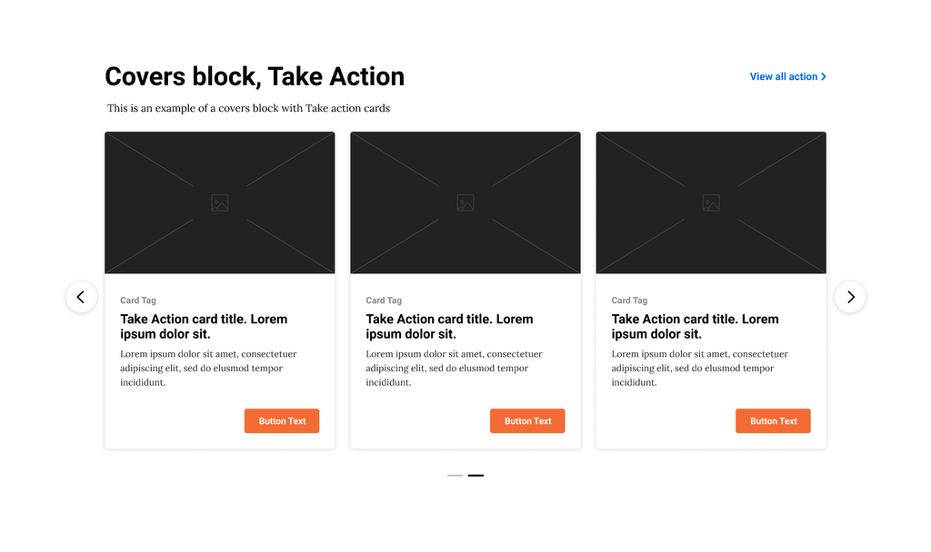
Covers block give editors the opportunity to organize the content in three main categories: take action covers, campaign covers and content covers
📚 Create Content > Blocks > Covers
Definition & Purpose
Definition
Use the covers block to integrate images and text cards to automatically display tags, take action pages, or Posts in a three or four column layout displayed in a grid or carousel. There are two main categories of covers – take action covers and content covers. Note: campaign covers are being phased-out.
Purpose
Groups information or content in a visually organized manner enabling the user to engage with the content.
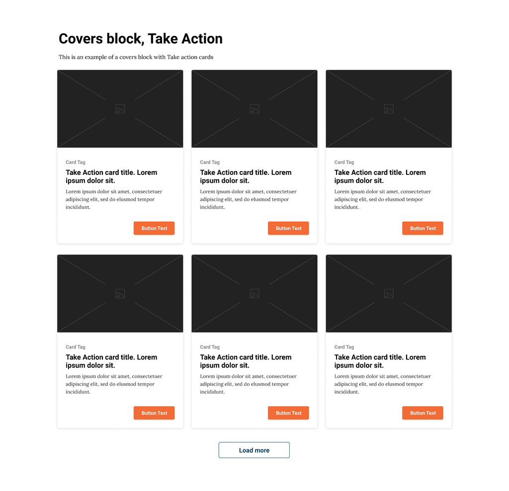
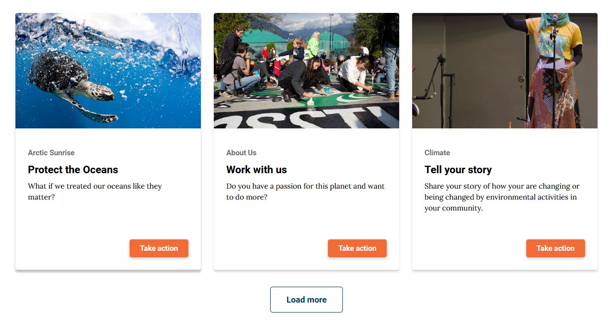
Take Action
Cards with an image and a text field below of related tags, a title, and description featuring an optional Call to Action button within a column layout.
Campaign
Shows tiles for each tag, useful for letting users browse by topic. This block is being phased-out.
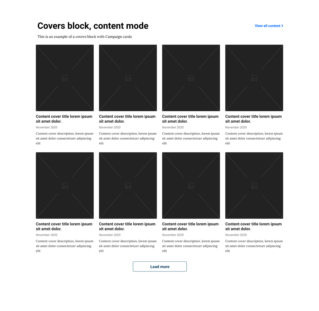
Content
Cards for content (blog posts, pages, etc.) optionally filtered by post type and/or tag.
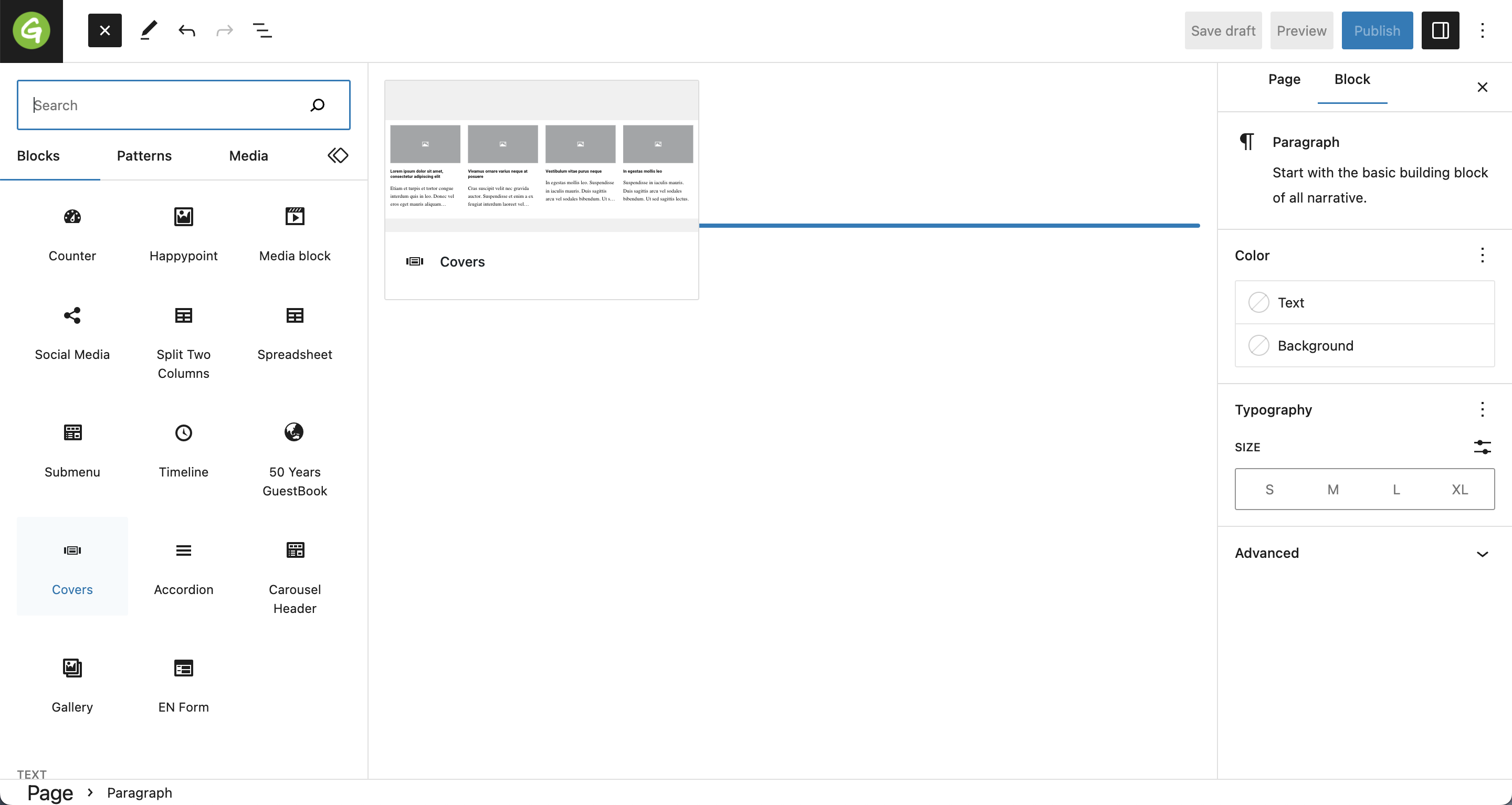
Covers
Where to find it
You can find the Covers Block by clicking the plus on the Top Left. It’ll be listed between the Blocks, with the name Covers.
Styles
The Covers block has three different styles — Action, Campaign and Content.
Each style displays a different kind of content in a different format:
- Take Action — Shows a card for each Take Action page (child pages of the “Act” page), optionally filtered by tags.
- Campaign — Shows tiles for each tag, useful for letting users browse by topic.
- Content — Shows cards for pieces of content (blog posts, pages, etc.) optionally filtered by post type and/or tag.
Covers block is a WYSIWYG block, so the title and description can be set on the left side, directly in the block, while all the other options are moved on the right side.
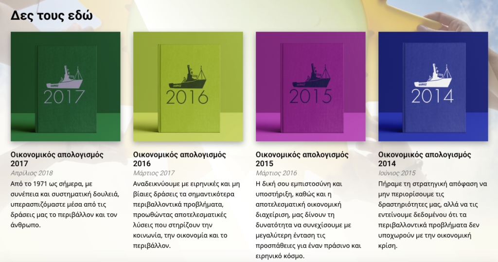
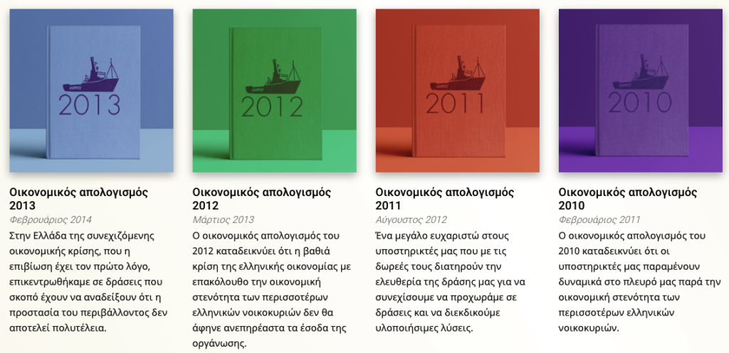
P4 Content Covers
Shows a card for each item of content (posts or pages).
There are two layout options for Content covers:
Grid Layout
Displays covers in a grid with equally-sized rows and columns.
Carousel Layout
Displays a single row of covers that is horizontally scrollable.
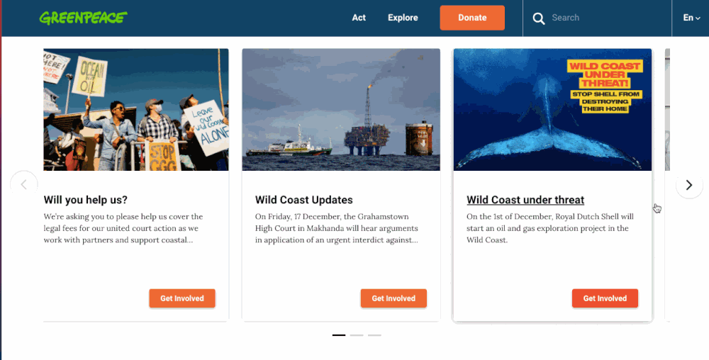
P4 Take Action Covers
Purpose: Display take action covers, categorized by tags or chosen manually. These covers (or cards) are the main way to navigate to engagement content, and MUST be associated to a Take Action page.
This style will pull all the Take action covers associated to Take action pages, corresponding to a tag or several you choose.
The Order of the Take Action covers is by default based on publication date / tags but it can be customized by changing the “Order” setting in the Take Action Page.
For ex, by giving 1 to the Take Action you want to appear first and 2 or 3 or higher to the others will determine the order.
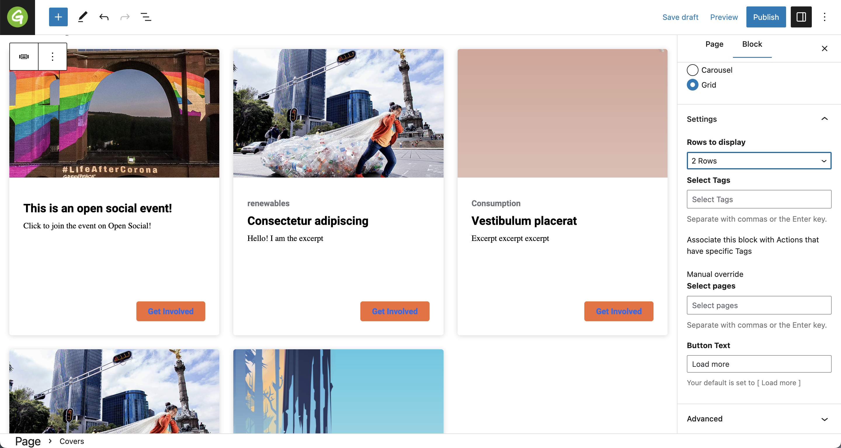
Grid layout
Displays covers in a grid with equally-sized rows and columns.
Carousel Layout
A single row of covers that is horizontally scrollable.
Take Action cover UI
- The entire card should function as a clickable link
- Card height is fixed
- Only show one tag, even if more exist
- Limit card title to 60 characters
- Limit card description to 110 characters
- Limit button text to 20 characters
- Button uses a new style, “Primary CTA small”
- Button stays in the bottom right of the card, even when the card text does not fill the entire space.
Content layout
Ideally, the Content Four Column can be used to dynamically pull out a set of publications related to each other, like our Greek colleagues did with their Annual Reports Page.
Settings
The block has the following fields available to edit:
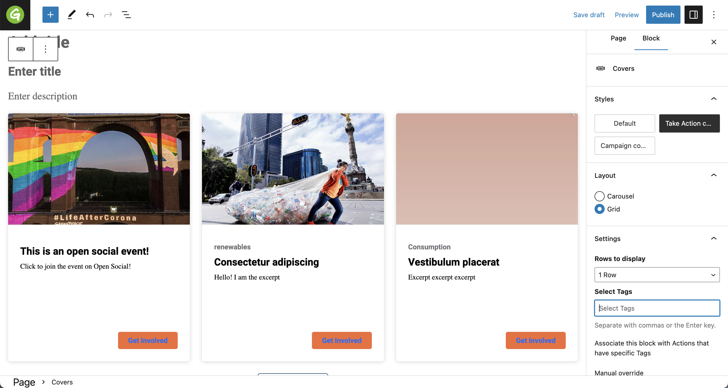
- Rows to display: you can choose from 1 row, 2 rows, all, meaning that the system will load as many rows with the covers as you want. For eg:
- 1 row means only 1 row with Take action cards will be displayed automatically, so 3 at number. If the visitor wants to see more there will be a ‘Load more’ button that will give the possibility to load more results. If no more results will be available, there is no ‘Load more’ button displayed.
- 2 rows means only 2 rows with Take action cards will be displayed automatically, so 6 in total. If the visitor wants to see more there will be a ‘Load more’ button that will give the possibility to load more results. If no more results will be available, there is no ‘Load more’ button displayed.
- all rows means that all the take action cards are displayed from the very beginning.
- Select tags: select the corresponding tags for the content to be pulled on
- Select post types: select the type of posts you want to be displayed
- Manual override. Select posts: select specifically posts. Once this option is activated, the previous Select post types becomes unavailable.
There is also a preview available in the Gutenberg editor.
⚠ Important : When you type a tag, the Manual override field is not available anymore. Same is valid for the Manual override field: if you start typing specific titles in this section, the Select Tags field will not be available anymore.
Design Elements
All design files of the block are available in the P4 Design Systems > Blocks > Covers
Links & Resources
Create Posts
Set up the P4 key Content (Navigation, Footer, Menus, Favicon, Post types)
Main Navigation
Images & Videos
Blocks & Patterns