Block: Details
Add a collapsable element that can hold columns, images, social media embeds, buttons and more!
📚 Create Content > Blocks > Details
Accordion?
“Isn’t this just the Accordion Block?” – Yes, and no.
The Details Block is the Accordion Block on steroids. The Accordion Block is limited to just text, when this Details Block can include several elements in the collapsable area, such as; columns, images, social media, buttons and much more. This Block is also WordPress native. Get creative!
Getting started
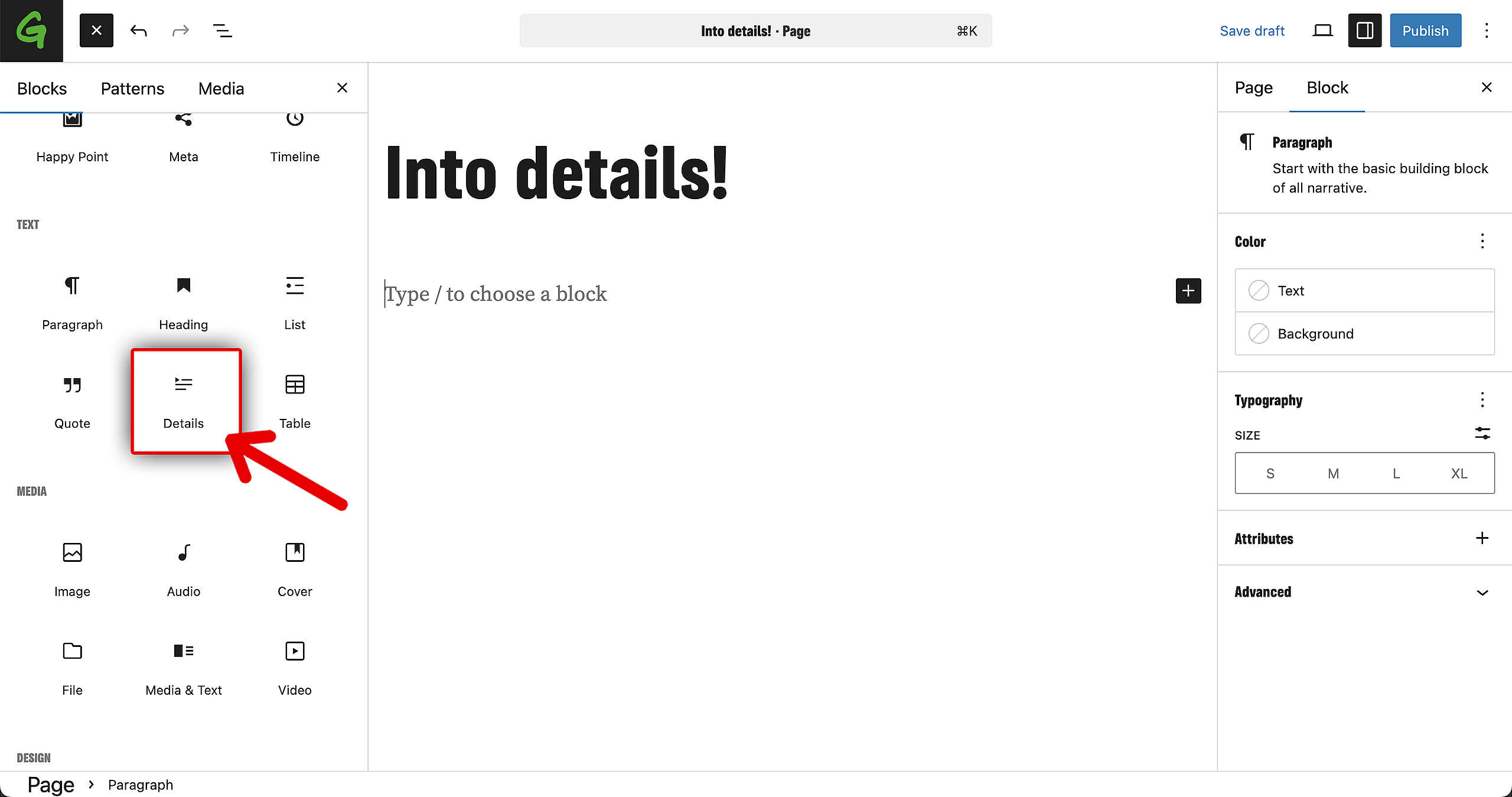
The Details Block is available on both Pages and Posts. Go to your Block overview on the left, and find the Details Block. Click on it and let’s get started!
Adding elements
First, fill in your title (red arrow in the screenshot). That text will always remain visible. Then, fill in the collapsable text.
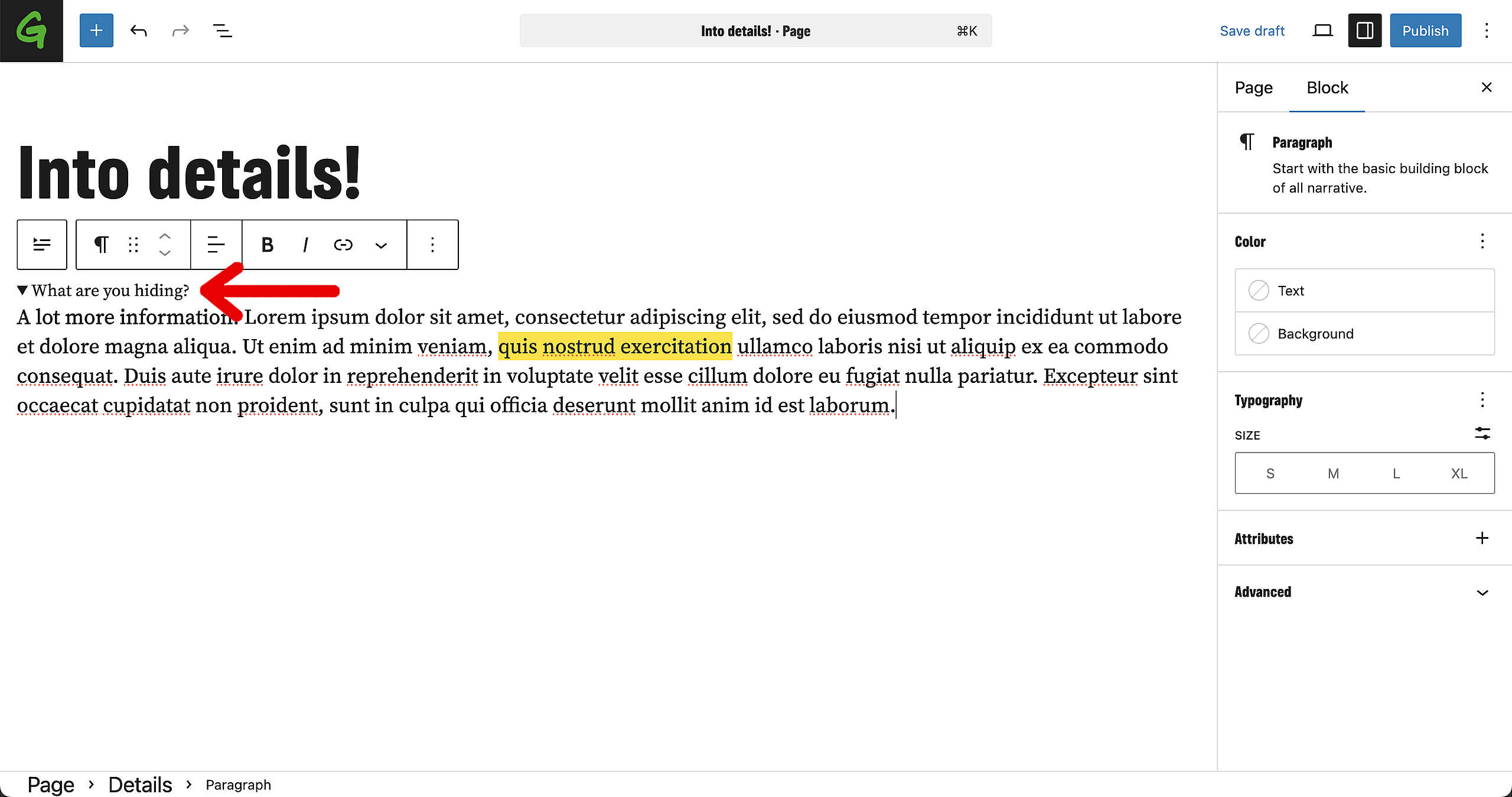
You can add more than just text in this space. Simply drag and drop Blocks from the left into the collapsable area and all the Blocks and elements that are in there will be hidden as well (until opened, of course).
Settings
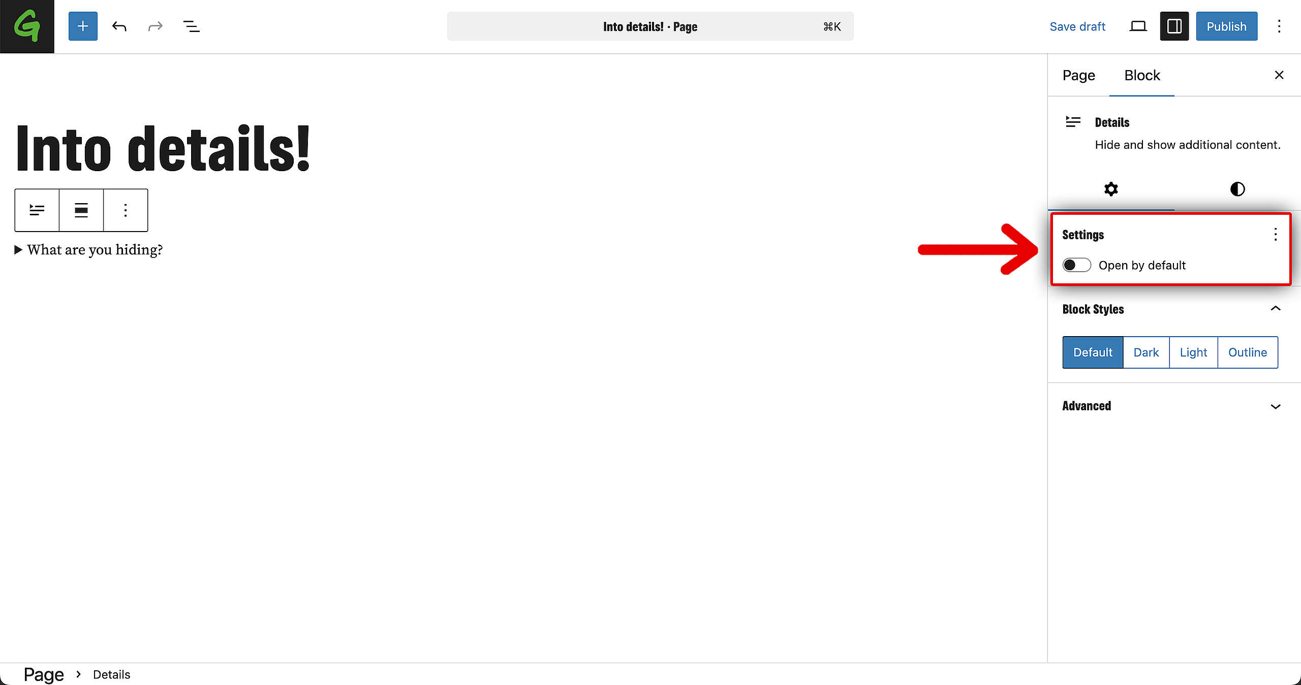
Open by default
In case you want the Details from the collapsable element to be open by default, make sure to go to the Block options on the right and select the option in the settings. When turned on, the collapsable (hidden) text will be visible by default.
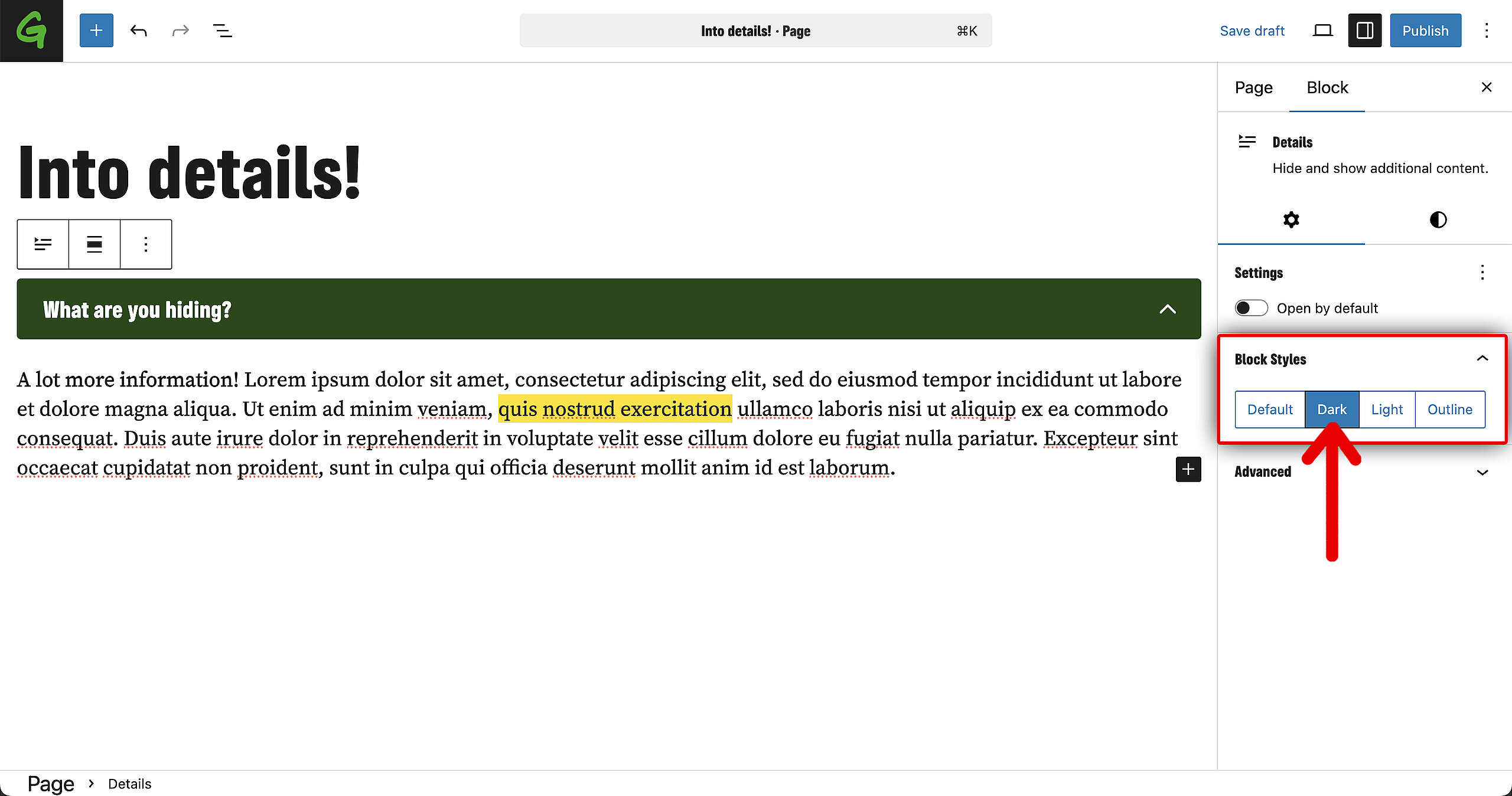
Design options
There are four different design options available for the Details Block:
- The default option is basic text, with arrow.
- The Dark option is with the dark green background color.
- The Light option with the light background color.
- The Outline option has no background color but has outline around the title box.
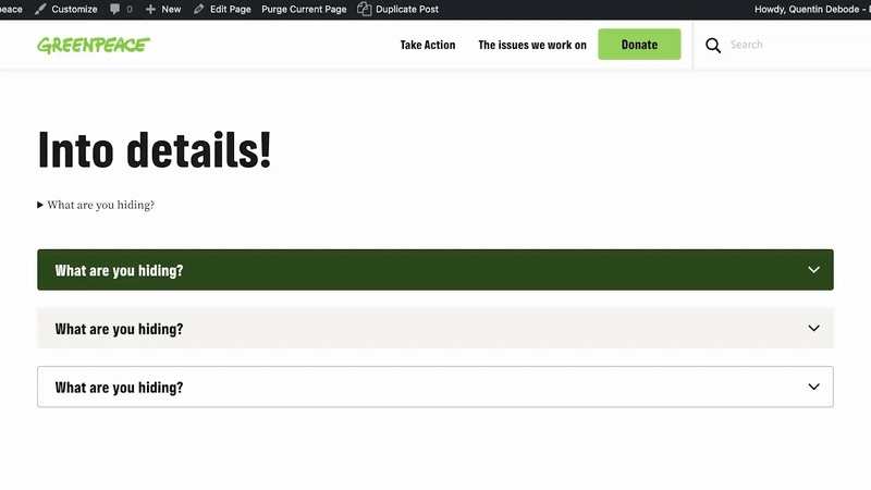
Result
Save the page, and this is how each design style looks!