Block: Gallery
Visuals are extremely impacting. Sets of images can convey a powerful message, if combined and displayed properly.
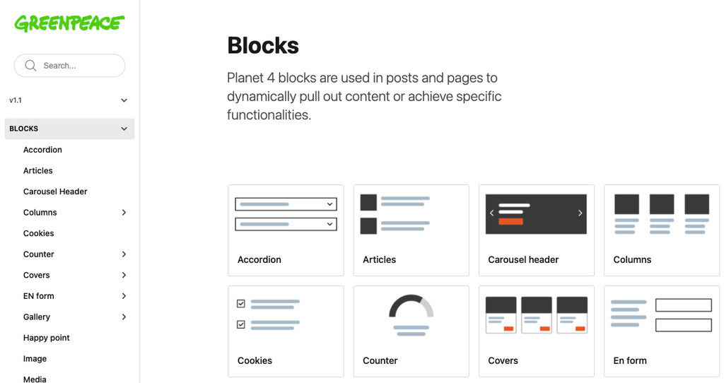
📚 Create Content > Blocks > Gallery
Definition & Purpose
Definition
Use the Gallery block to display images in a carousel or a grid.
Purpose
Allows users to engage with multiple images in a structured and organized manner.
Slider
A carousel of images relevant for the topic with arrow selectors on the sides to switch from one image to another.
Grid
Use this style to show thumbnails of lots of images, properly aligned. Good to use for storytelling, when showing lots of activity on a particular theme.
Grids are used to give an overview at a glance, called helicoptering. For example, they can be used by a campaign to show e.g. “the story so far”, “what we achieved”, or “where we are going”.
Edit mode
The Gallery block is a WYSIWYG block, so the Title and the description can be edited in place. Then, the images have to be selected.
After all the images for the slider have been selected, you can next choose the image focal point on the right side of the block. There is a circle displayed on the image, so you can simply move it around to choose where to set the focal point.
You can easily edit and delete or add more images by going at the top of the block re-selecting photos.
Design Elements
All design files of the block are available in the P4 Design Systems > Blocks > Galley