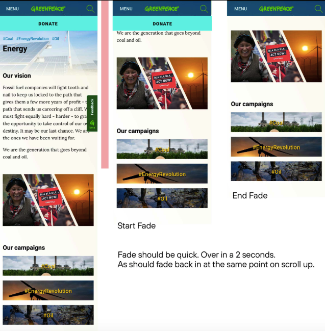
The donate button is hidden on mobile / responsive views, which implicates in a bigger journey for donators. This doesn’t happens on desktop website, where the button is placed in a rich website position on the header. On mobile, I think most of the users simply don’t see the donate button.
It would be nice having the button placed on the mobile header, it could improve the number of donations and that’s the biggest point of this idea.

Here’s some examples :
– https://www.greenpeace.org.uk/
– https://www.greenpeace.org/usa/
– https://www.msf.org.br/
– https://www.unicef.org/
– https://www.doctorswithoutborders.org/


