Block: Carousel Header
Display several photos on a scrolling carousel for the home page
📚 Create Content > Blocks > Carousel Header
Definition & Purpose
Definition
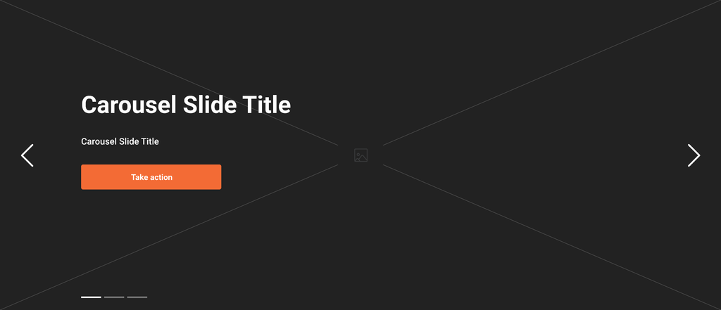
The Carousel header is a gallery block that features a scrolling collection of images and media content, typically found at the top of the Homepage. Editors can add a header, text, and CTA overlaid on top of the image.
Purpose
Provides a visually engaging way to display and highlight content, allowing for a more dynamic and interactive experience.
Pages: Home (at top)
For content images the max width is 1140px. To ensure quality please supply images with a width of no less than 1140px. An ideal width would be 1440 pixels to allow for any minimal cropping – more on Image Ratio and visuals.
The Header Carousel can be swiped left for S/M sizes on both Right-to-Left and Left-to-right effects, depending on your alphabet..
This style allows a carousel spanning across the full page width using a classic look: big slides, fade transition, and no sub-headers. See all screens here.
Edit mode
Just like any other block, the Carousel Header switched to WYSIWYG, meaning that the options such as title and short description for each image and the CTA button can be done directly on the editor.
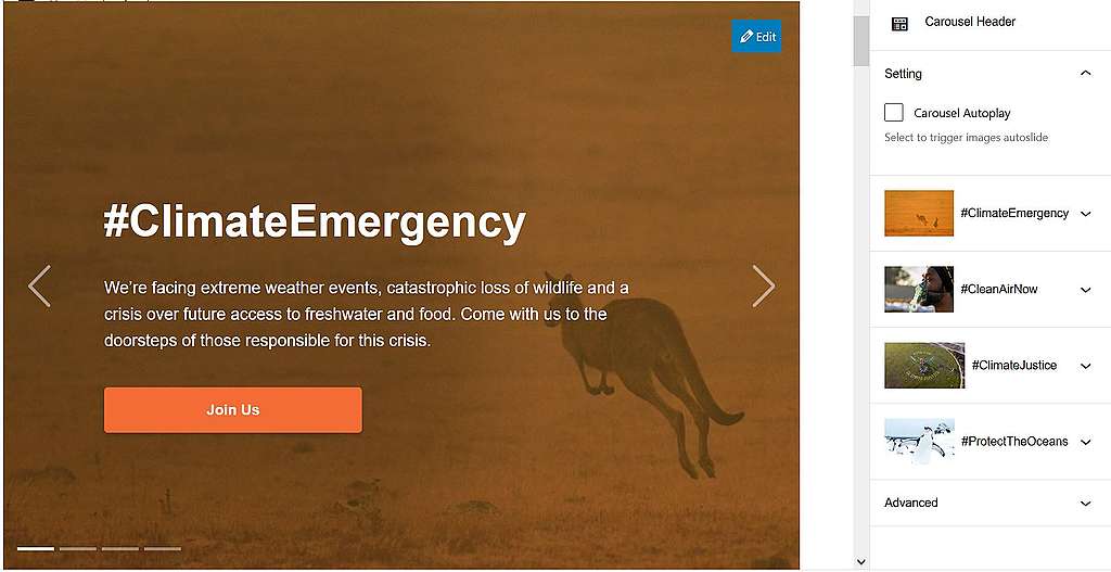
The carousel elements can easily be switched by drag and drop.
Frontend rendering

Carousel Autoplay
- Since release v.1.46 , an autoplay feature was added to this block: the carousel header auto play slides animation, which can start based on 2 triggers:
- Automatically => since release v1.48 the web editors have the option to choose if they want to auto play slides animation. A new button, which is activated by default has been added to the corresponding block.
- Manually => if users click on the right or left arrow or on the page controller.
- When the Carousel Header has only 1 slide, the arrows and the page controller should not be displayed. Also, the slides animation should not play. However, there should be no data on the next slides (2, 3, 4…), no image, header, etc. for this to work correctly. There should only be data on the first slide.
Editable options
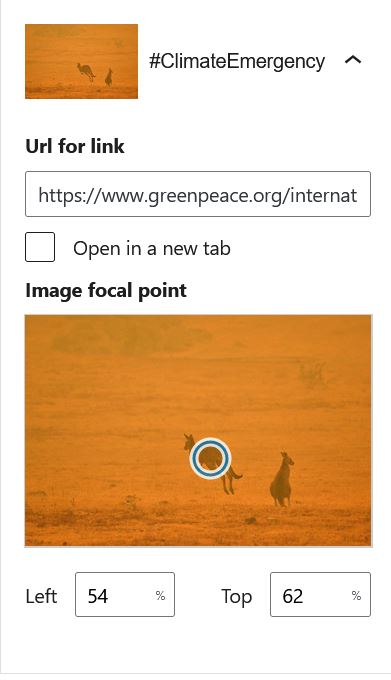
When you double click on one image on the right side of the block, you have the option to add an URL, to decide if to open it in a new tab or no and to establish the image focal point.
You will see a circle with blue margins on the image. Drag and drop it on the image where you want the focus point to be OR add numbers in the Horizontal Pos. and Vertical Pos. spaces.
Do’s & Don’ts
Do’s:
You should use as much as possible:
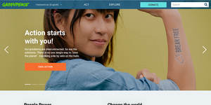
- Simple & clear photos.
- Photos with main subject(s) centred or on the right hand side.
Examples:


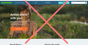
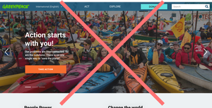
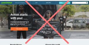
Dont’s:
To ensure the text and call to action legibility, you should avoid using as much as possible:
- A photo with a subject (person, animal, object …) on the left hand side.
- A too complex photo with too many subjects (people, animals, objects …).
- A photo that contains text (banners, placards …).
Examples:
Design Elements
All design files of the block are available in the P4 Design Systems > Blocks > Carousel Header
Links & Resources
- Handbook
- Set up the P4 key Content (Navigation, Footer, Menus, Favicon, Post types)
