
#Engagement
Leveraging its great tech,P4 can be used in multiple ways to mobilise supporters, involve collaborators, align with colleagues and engage with millions.
Related Articles
-
P4 Manual Accessibility Audit Recap
After we completed the manual accessibility audit as the P4 team, we’ve rolled out a series of enhancements across the site to make every interaction clearer and more inclusive. Below…
-
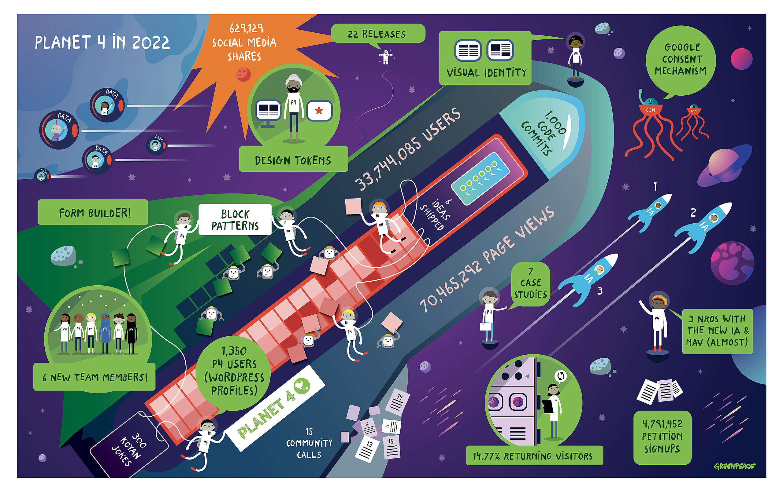
P4 in 2022
Let’s continue on our little trip, our supersonic ship’s at our disposal to keep reaching the sky 🚀
-
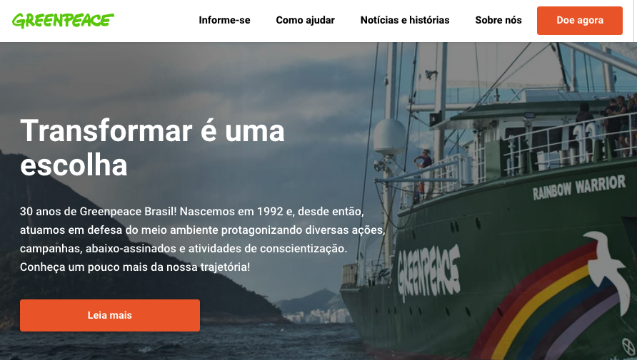
How Greenpeace Brasil piloted the new P4 Information Architecture 🇧🇷
We just launched the first P4 site using the new blocks and patterns, here’s how it all happened.