Sprint #94 was dedicated to the latest preparatory work for the upcoming Campaign Project Pages (stay tuned!), to introduce the revised Greenpeace Logo, a new “thank you” screen for the EN form Block, and fix the UX of some of the existing blocks.
Release v1.61 (17/7/2019)
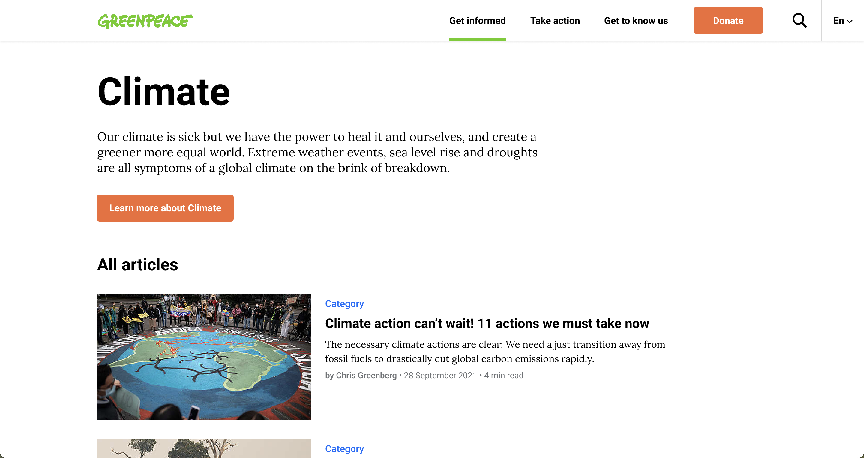
- PLANET 3715 – Replace old Greenpeace logo with new Greenpeace logo (Branding)
- The Greenpeace Brand team have adjusted the Greenpeace logo to a more readable version. Here’s the details on what has changed!


Engaging Networks form improvements 📣
- PLANET 3702 – Apply styling to thank you screen (in-page) of petition form (UX)
- A total new in-page “thank you” screen for the ‘Form on the side” style of the Block: Engaging Networks form, to add more style to your P4 campaigns!

- PLANET 3711 – Add option to customise non opt-in “Checkbox” field type (UX)
- Checkbox questions type of forms in p4 are now customisable (fetching language locale from your NRO EN account)
- Text customisation of values in checkbox type is not yet available, will be next release 🙂
- Checkbox questions type of forms in p4 are now customisable (fetching language locale from your NRO EN account)

- PLANET 3738 and PLANET 3739 –Too much bottom padding on the country selector + styling to be added on Safari (Bugs)
- Our eyes were bleeding when seeing the huge padding and the weird style (on Safari) on the country selector of the “Form on the Side” style of the EN Form block

Campaign Project Pages (CPP) preparatory work ✊
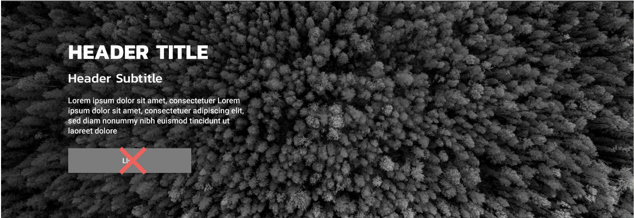
- PLANET 3744 –CSS changes to hide call to action buttons in all blocks (UX)
- all “Call to action” buttons in the following blocks have been hidden (for the Cmpaign content types):
- Header – Carousel header – Columns block / No image layout version – Split Two Columns
- all “Call to action” buttons in the following blocks have been hidden (for the Cmpaign content types):
- PLANET 3747 – CSS changes to links and tags in Articles block (UX)
- Some UX adjustments to the Articles Block that will be used in the Campaign Pages… more coming soon
- PLANET 3686 –Add light and dark Greenpeace logo to CPP customiser (UX)
- P4 Campaign Pages will have the option for a minimal header, and we had to include the Greenpeace black and white logos, since the green one will most probably clash with all the other colours on the page.
- PLANET 3741 – Submenu block should not be available in Campaign content type (UX)
- Planet 4 Campaign pages are not likely to use the Submenu block, so we removed it.
P4 Blocks improvements 🧩
- PLANET 3689 –Update icons block to accommodate full column width images (UX)
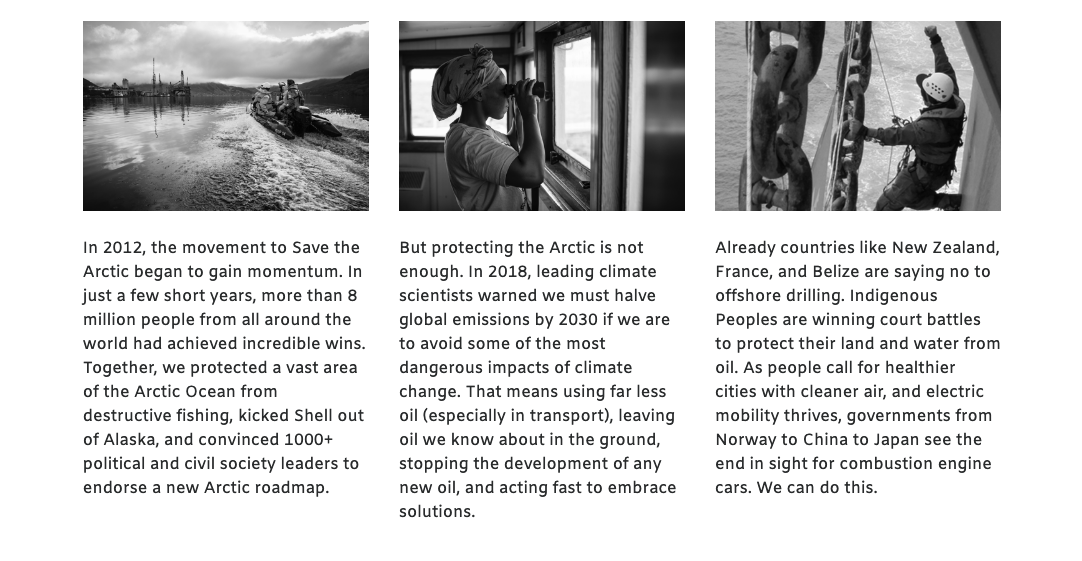
- The Columns block has new style called “Images”; it is similar to the Icons style in that it has a text link rather than a button, but instead of a small icon it allows for a full column-width image.
Blocks edit menu

Front end
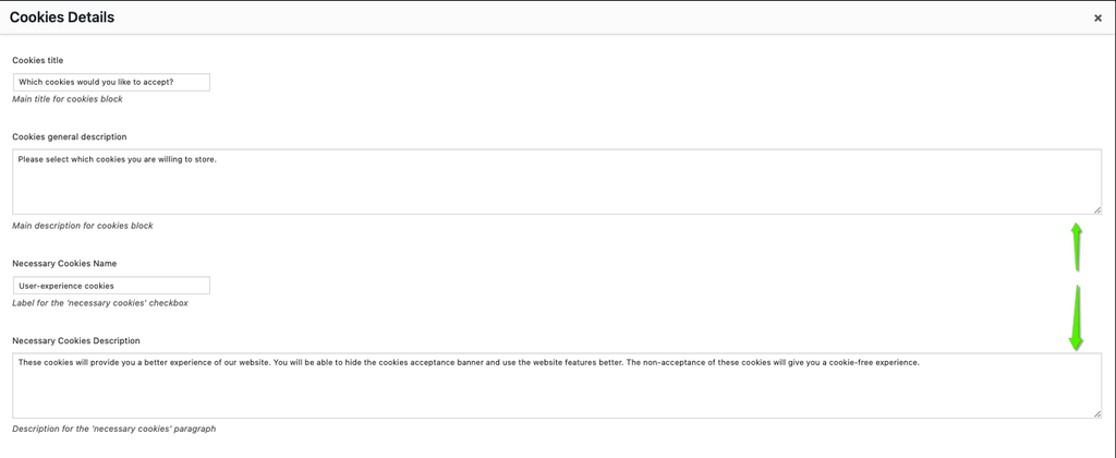
- PLANET 3728 – Cookies block: make cookies description field expandable (UI)
- It’s much more easier to provide cookies description in the Cookies Block, with the “Cookies Description” field expandable.
- PLANET 3770 – Remove “Sub-header” block from list of elements (UI)
- No one is using the Sub-header block anymore, so we removed it from the “Add page Elements” menu
- PLANET 3734 – Grid & 3 Column style images are blurry when used in Posts (Bug)
- Two styles of the Gallery Block were rendering blurry images, when used in posts… all good now
Geek alert 🤖
- PLANET 3639 – JS: Use let and const, instead of var. (Code Cleanup)
- As part of our Code refactoring, we decided to use “let” and “const” instead of “var” in javascript

Pull out static content (with or without images) or take action tasks in columns.
Learn more
