⚠ You can use the Take Action Boxout Block to reach the same (if not; BETTER) results.
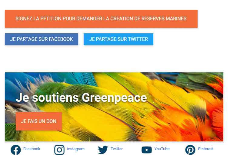
Over these past months at GP Belgium, we created some custom buttons for the bottom of our blogs (so we could easily track the activity on it (and they have been getting good results)). In the screenshots, you can see how they look.
Or you can see them live here or in any post of the Greenpeace Belgium website.
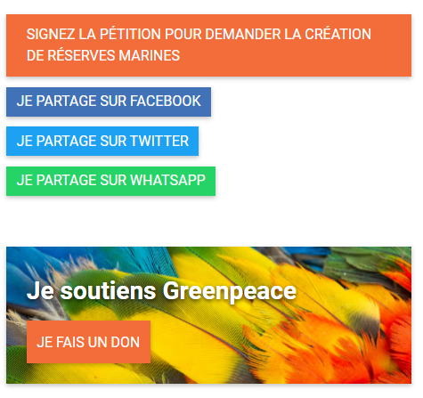
Why we did it
We found out that visitors click often on the share buttons (especially Whatsapp, that’s hidden on desktop but appears on Mobile) but rarely click on the social media channels. The Social media icons on the footer were not getting much love, so we tried boosting it a bit by adding it more visibly on the places people visit most which, for us, is on the blog posts.
How we did it
We did this through adding a bit of CSS (that does not change anything else, don’t worry) to make them pretty. And to use them on the site itself, you add a “custom html” block and just drop the code in there. Easy peasy.
Find the HTML here. And the CSS here.
Why this post
’cause #SharingIsCaring
Check the P4 technical documentation and learn how to develop your child theme

