Hi all fellow p4 wannabees!
Bzzz… Bzzz… We are pleased to announce that the Greenpeace Netherlands is A-live! Greece and India already supplied you with some outstanding tips, so here’s our two cents. Just pick what you think will be useful for your planet instance!
We went live in bèta and we are still working hard to improve our site!
Our main focus points for the new site are:
-
Site speed: We strive to achieve a page size below 2mb.
- How: At least our most important pages, in line with Google standards, should be under 2mb. Most page load size in p4 is taken up by large images. If you want to achieve fast loading pages, make sure to compress your images and check if they are under 200kb for big images and under 100kb for action block type images. Don’t use your background image for action blocks or your action page will be enormous. As of 27-6, the p4 team has improved image compression in the site but it doesn’t hurt to keep an eye on this for webmasters. The result: Google gives us an 8.2 for our desktop homepage!
-
Testing supporter journeys: We tested our new tiny menu
- We translated the ‘ACT’ and ‘EXPLORE’ page with (the Dutch equivalent of) ‘ACTIONS’ and ‘SOLUTIONS’. The latter with the idea of also showing more of ourselves as solution focused activists in line with the 7 shifts, meanwhile referring to more information on our topics. The word ‘solutions’ does not literally cover it all, but from our tests it appears people will find their way to the content underneath it nevertheless. What we did:
- We used the online tool Optimal Workshop before launch to test the site menu for realistic user journeys. Most supporter journeys were completed in the right way, however as we expected some will need improvement. Most people find their way to the footer these days we chose to put more stuff in there then in the GPI version. This works well. And we’ll build upon that. The hardest supporter journeys for us that are left to tackle are: 1. Where we can showcase our success stories, and the success stories of our change agents, and 2. if people want to find more info on alternative donation possibilities such as legacies or one of our dedicated programs we did not yet find the best path for them to follow.
- From user testing with the p3 site we knew that our supporters are not using the carousel the way that we generally assume they will, so we decided to break down the carousel to show one image only.
-
Campaign teams filled the site with their own content and gained more ownership.
- Our team set up some tag and action pages quick and dirty, and as much as possible we had the campaign teams review and redo their own content, as to directly give them ownership. So the p4 team was dedicated to providing trainings and looking after the setup of the main navigation. Campaign teams pick up on the way the pages work very quickly! Make sure to be available for questions, we did multiple hands on workshops which worked very well. Some campaigns had their whole content set up on the site within a day. Also still some work in progress, here.
-
Custom development
- Since we’re not using Engaging Networks, we need to build some templates for donation and petition pages: blocks/widgets connecting the platform to our unique database. This meant we were (sort of) the first NRO working with developers. The P4 team provided as much time as possible to get them up and running! Because we were the ‘first’ our developer Fabio Bier also made a package ‘P4 in a box’ for quicker setup of the P4 environment for developers. Give Fabio a shout if you are working with developers and want to onboard them quickly!
-
Team focus: Why we left out the detailed planning
- So you have made sure you have a dedicated team, as everyone is assuring you is a very important step, which is true. The way we worked, which may very well not work for everyone, was to have people just book days of ‘planet 4 work’ in their agenda instead of planning each and every step that needs doing in detail. I’m not sure this was the easiest for the GPI P4 team, for which I apologize. But it saved us massive hours of detailed planning, while we could just actually do stuff. Next week we start the first scrum sprint to improve on our p4 site.
-
We did not go “blank canvas”…
- At first, we wanted to migrate minimum content as well, but we got warned by our external agency that supported our migration from a SEO-perspective. Although we agreed with the GPI P4 team that good SEO nowadays means: ‘make good content’, many marketeers believe in a thing called link worth and ranking of your pages in Google. We didn’t want to abandon content that ranked good in Google and improved our site’s status. Roughly 50% of our link worth, that is of benefit to our whole site, turned out to be in our old articles, press releases and publications. We decided to MOVE THEM ALL. I won’t advise anyone to just follow that example. But I will advise every office to think through where in your site most of your so called link worth is, and whether or not you are willing to take a chance with Google. We let the external agency track unwanted 404’s which, in all honesty, created a very annoying process for everyone involved. If you want to do something similar: best is maybe to get someone in house with access to tools to check for migration issues. The whole process we had will be very different for other offices, we had an abnormal migration because we came from the .nl domain instead of .org – it complicated our redirect strategy. Now we have to wait to see what our decisions did for our traffic.
-
We implemented some style changes
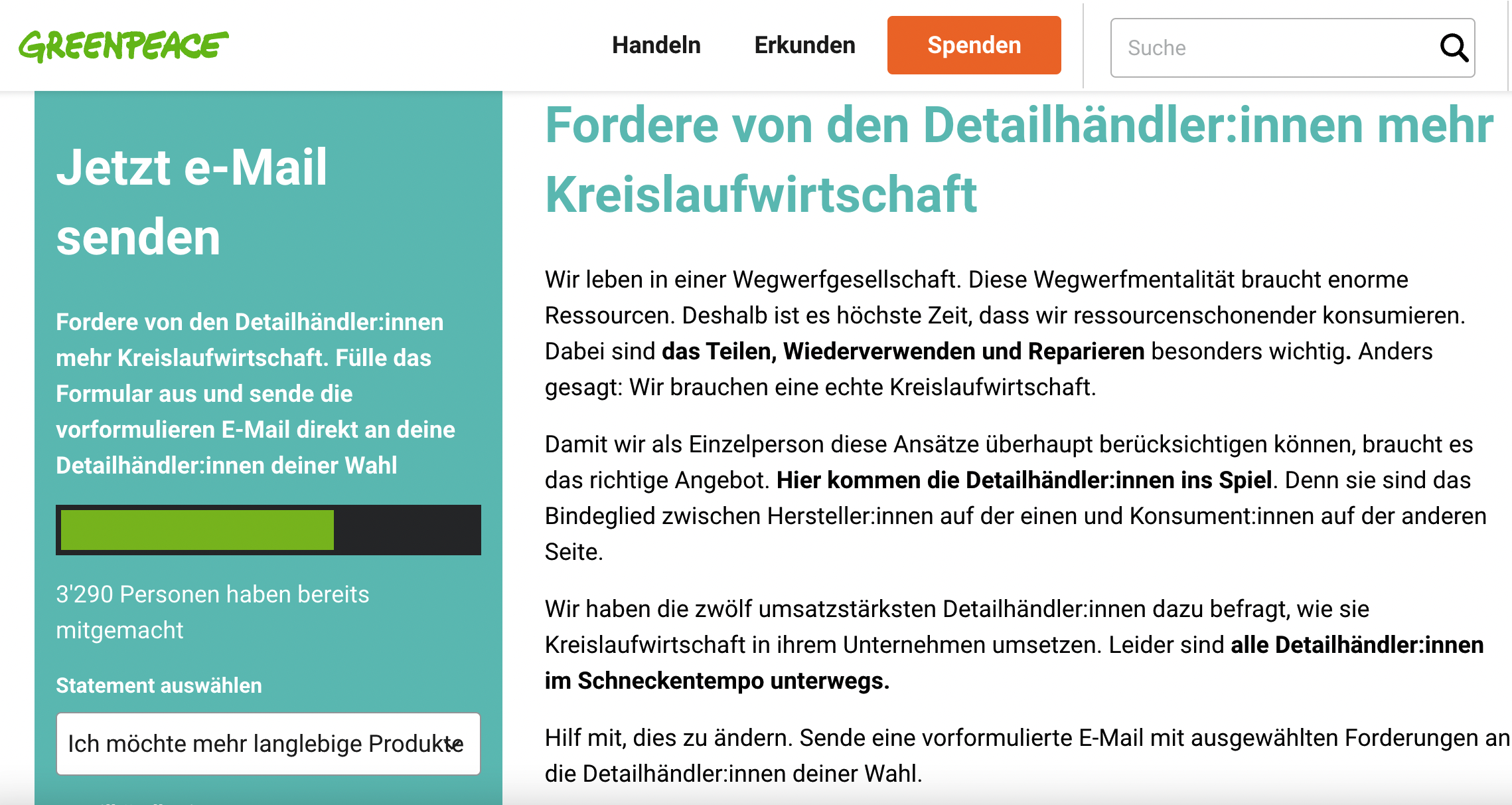
- Because our office’s communications have not changed with the launch of the site, stakeholders requested that the site looked more in line with our Dutch branding. In the Netherlands we use a lot of GP-green, supported by clean white, therefore we changed the dark blue coloring of the top menu bar to white, to put more emphasis on the green logo. Also, the age of our supporters in general is higher than average, thus we expect more visitors with below average reading capabilities. Therefore we implemented some changes to improve readability. Since the office is working on a new overarching style guide we only sticked to some simple changes. Check the style changes in the live site.
Next steps:
- Two scrum sprints to improve fundraising performance of the platform
- Two scrum sprints to improve general performance, set up more tests and improve load speed and conversion-%
Hope we can work with you all, share the love, the code and the best practices!
Feel free to leave comments, questions and critique to help us improve!
On behalf of the whole P4 team in NL,
Berit


Discussion
Thank you Berit for this Post -- it's a great summary of a lengthy process. I love that you collaborated with us and are trying your own thing. Looking forward to seeing what you contribute back to the community. :-D
Ace tips, thanks for sharing, Berit! Congrats for your launch!