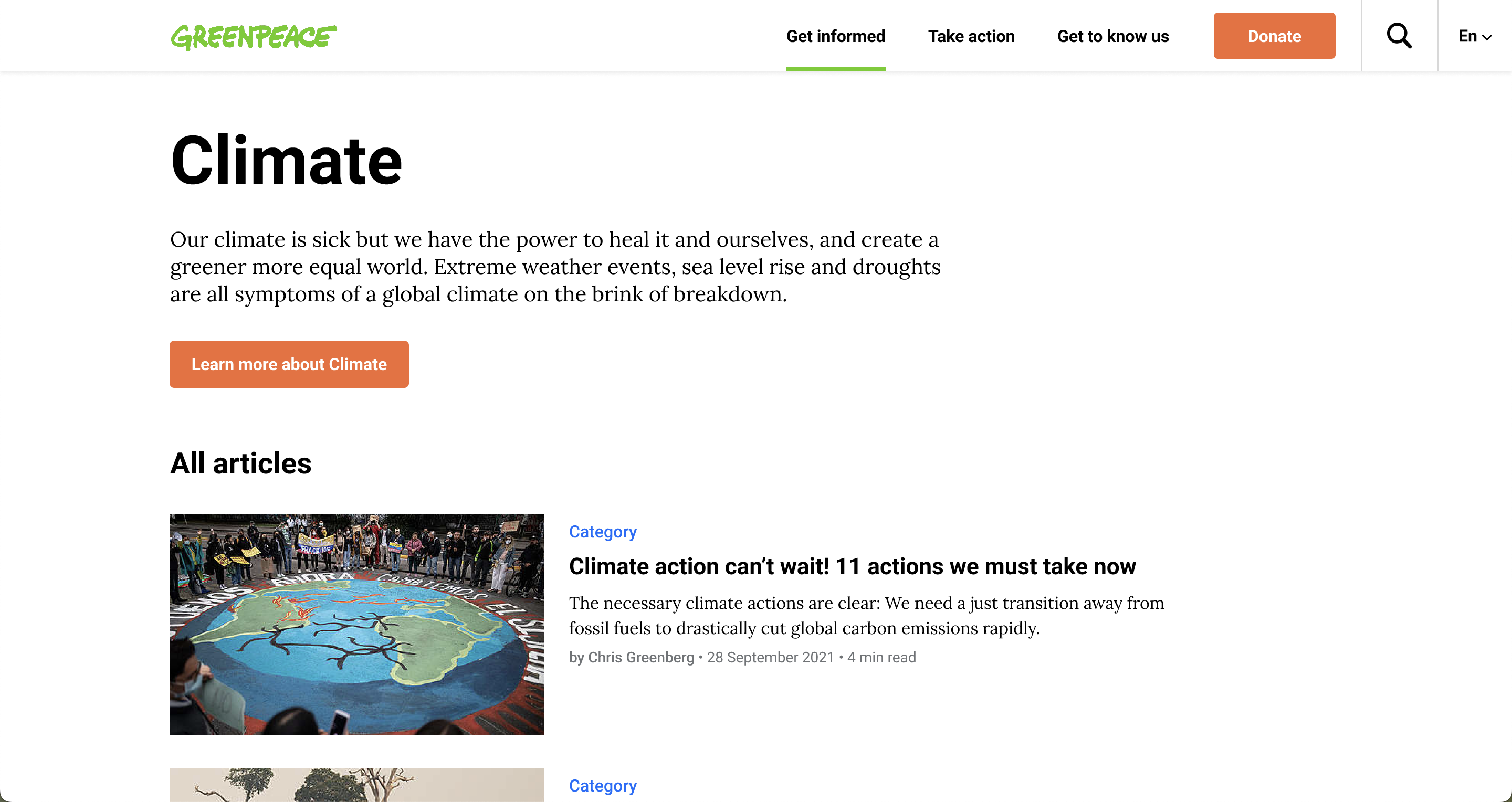
In this release, the team focused on bringing improvements to the recently launched carousel header, making some design improvements and fixing some bugs.
Release v1.46 (13/3/2019)
Design and UX Improvements 🎩
- PLANET-3275 – New Carousel header – autoplay slides animation
- The slides animation for the new carousel header (Full width classic style) can start based on 2 triggers:
* Automatically => If users don’t click on the homepage or don’t scroll for 6 seconds, then the next slide of the carousel is displayed.
* Manually => If users click on the right or left arrow or on the page controller.
- The slides animation for the new carousel header (Full width classic style) can start based on 2 triggers:

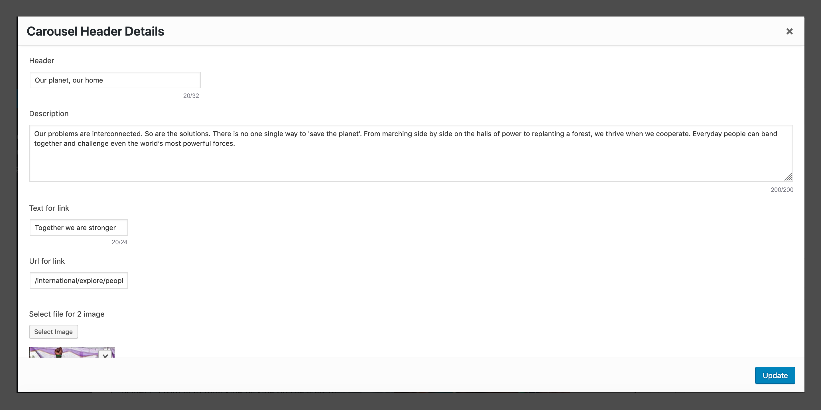
- PLANET-3276 – New Carousel header – display character number limitation on WordPress.
- In the Carousel Header block, there will be displayed character number limitation on WordPress to inform web editors how many characters they can type on each field. The number will update while editors are typing text.
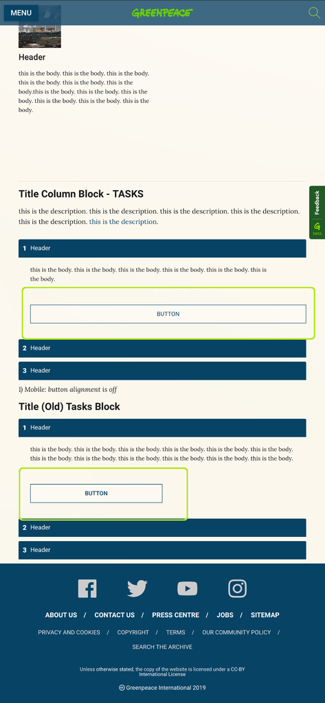
- PLANET-3279 – Mobile secondary buttons wrong size
- The mobile buttons for columns block on tablet (m), portrait orientation, were the wrong size. Have a look below to see the difference between the sizes of the two buttons.
Bug Fixes 🐛
- PLANET-3254 – Apply text rules from Marvel doc
- Instructions for text (title / description / call to action) length and style have been applied for the Header Carousel block, the Full width classic style.
- PLANET-3260 – Media Library Image Credit missing
- The ” / Greenpeace” was being stripped from the credit field. When an Editor embeded an image from the GPI Media Library, the full credit was not being pulled over.
- e.g. © Christian Braga / Greenpeace appearing as: © Christian Braga
- This bug appeared recently and has now being fixed so it should display full credit again – eg: ‘ © Christian Braga / Greenpeace ‘
- The ” / Greenpeace” was being stripped from the credit field. When an Editor embeded an image from the GPI Media Library, the full credit was not being pulled over.
- PLANET-3274 – New Carousel header S (mobile screens) – reduce padding between text and CTA, and page controller
- The padding (the space inside the border between the border and the actual image or cell contents) was making the white spaces inside the blocks to overlap the CTA on small screens, so it had to be resized
- * The margin between the text and the CTA and the one between the CTA and the page controller have been resized and all looks good now
- The padding (the space inside the border between the border and the actual image or cell contents) was making the white spaces inside the blocks to overlap the CTA on small screens, so it had to be resized
- PLANET-3282 – Carousel (not “carousel header”) indicators off-centered
- The indicators (the small white circles from images captions) for the Carousel (not the “Carousel Header”) should be displayed on the bottom right corner inside the captions of photos, except for mobile (the smallest size) where they should be centered. After a quick fix, the carousel indicators are back to normal. See below the correct and the wrong position of the indicators.
Correct display on L screens
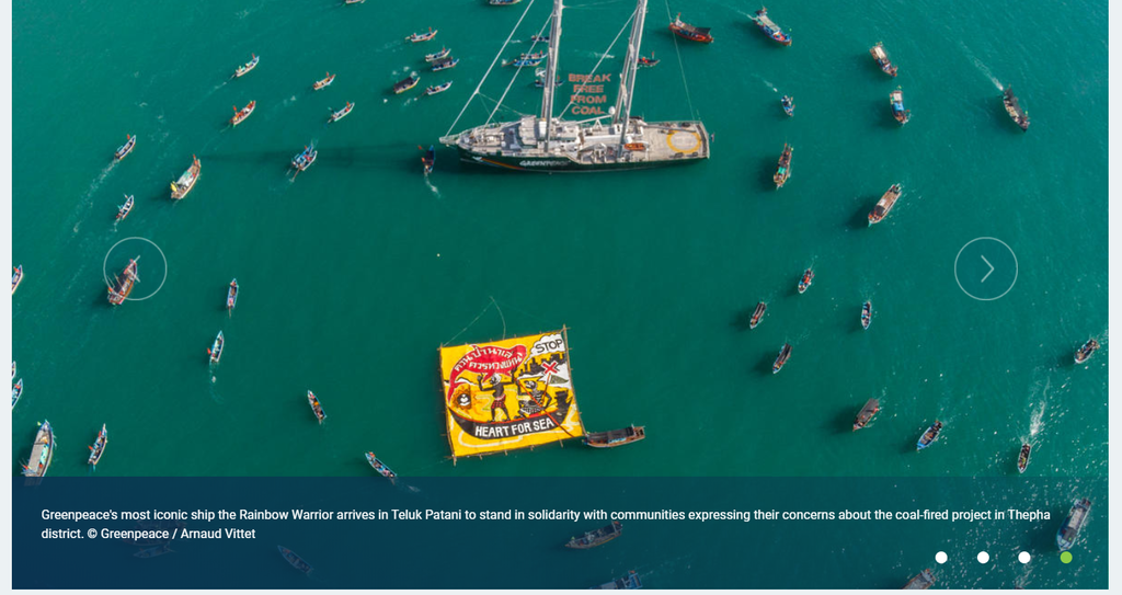
Wrong display on L screens


