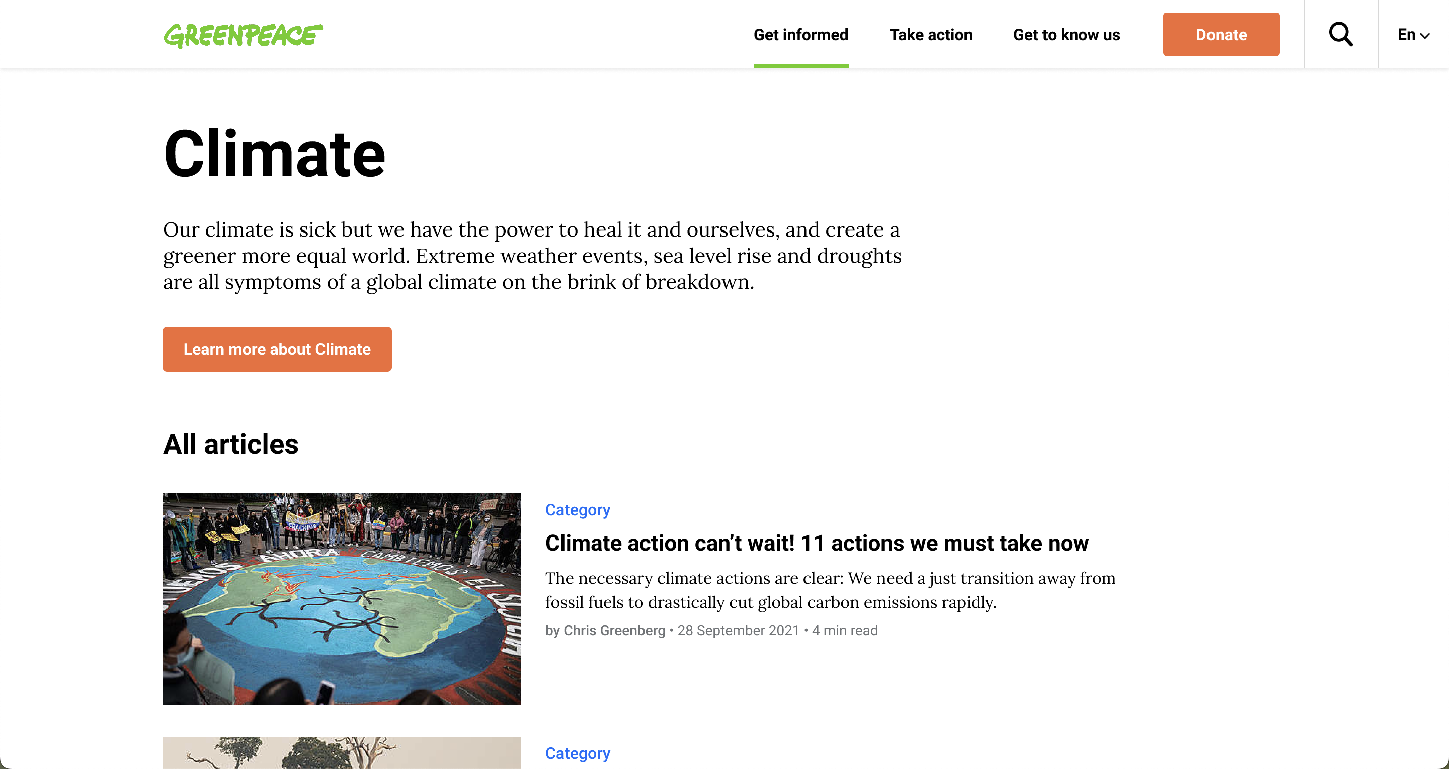
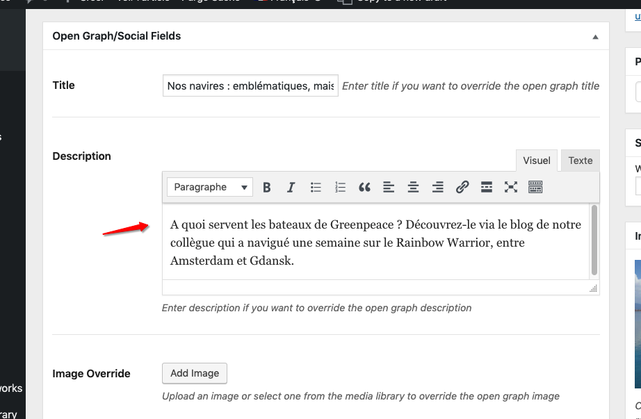
With most of the work focused on the Gutenberg transition, this relatively small release brings in only a few updates: the “Hide page title” command released a few weeks ago has been improved, the navigation bar items have been aligned; the html markup from Open Graph description field stripped.
Release v2.5
Design and UX Improvements 🎩
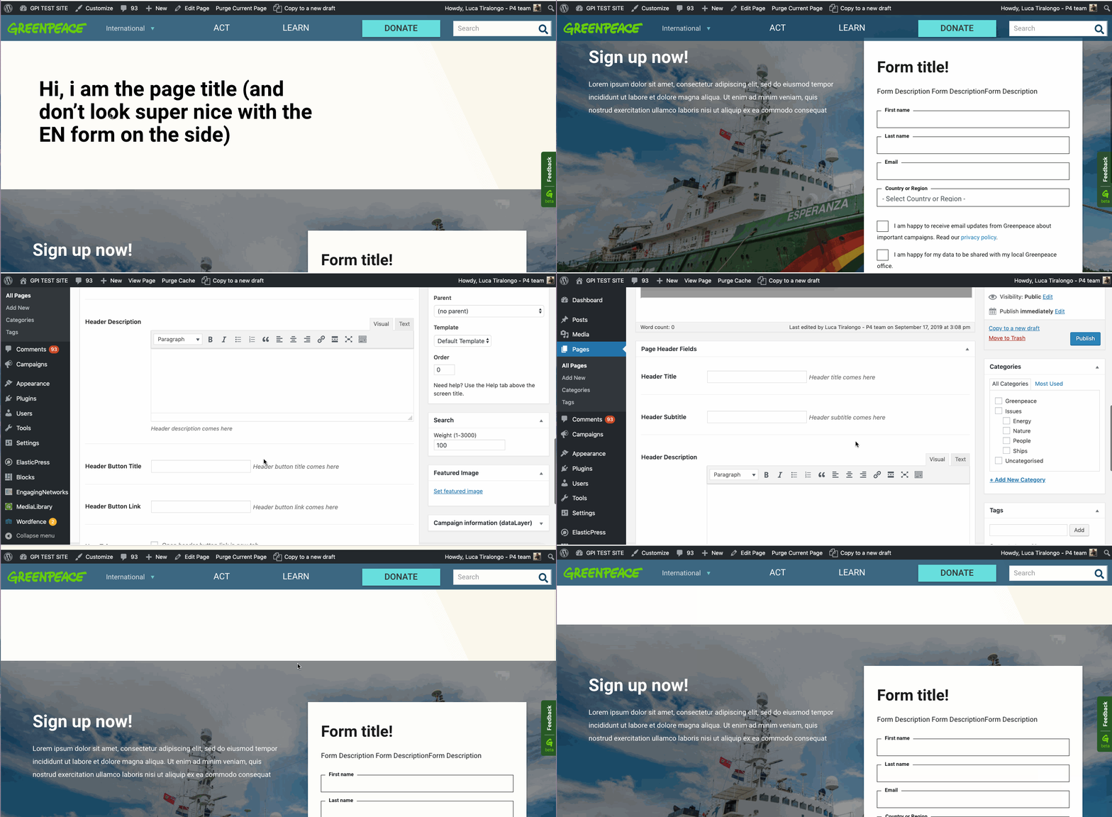
- PLANET-4101 – Pages: if “Hide page title” command is ticked, space between header Nav and body should be removed
- This was a follow up ticket following a recent improvement, PLANET-3875, that allowed editors to hide the title block from the user whilst still having the title in the system, functionality created for CPP. This time, the team had to make sure that if the “Hide page title” command is checked, space between header Nav and body is removed.
- Have a look at the GIF below to make sure you don’t miss what this is about
- PLANET-4206 – Align navigation bar items
- Some elements on the navigation bar were a little off and had to be aligned..
- GP logo | Donate | search are now the same height, the border on the input was removed (it actually made it look smaller).
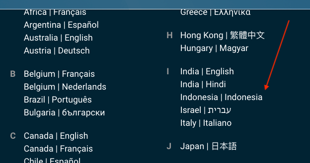
- The country list was separated from the bar by a 1px gap, the gap is now removed.
- Some elements on the navigation bar were a little off and had to be aligned..

Bug Fixes 🐛
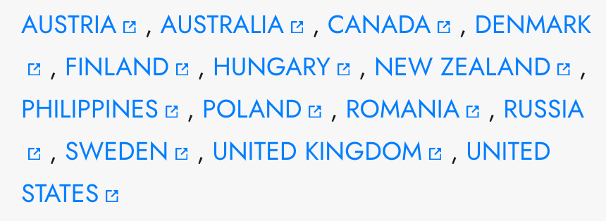
- PLANET-4176 – External link icons should be preceded by a non-breaking space
- Where there are two examples of the “External link” icon breaking into a new line, the expected behavior is to use a non-breaking space so the text and icon stay together. This was fixed and the two links should always be on the same line from now on.

