Include Call To Actions within posts and pages through a dynamic floating card!
Read moreA release with a lot of updates and improvements: author image added to posts, new design for Comments block, new design for Take action boxout block and for Covers block – Take action style, WYSIWYG version for the Covers block and centered layout for Posts page.
Features🎩
- PLANET-6188 – Add an author image to Posts
- The Author’s profile image is now pulled out right underneath the Post title and displayed next to the name
- Here’s how to customise your profile picture
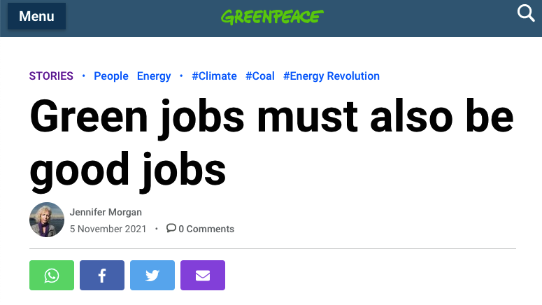
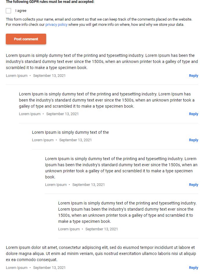
- PLANET-6071– Implement the new design of the Comments block
- Implemented the new design of the Comments block on the Post pages.
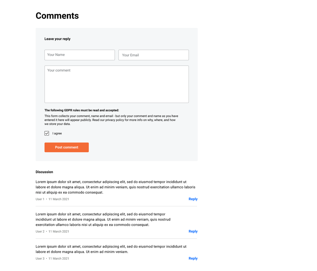
- PLANET-6070 – Implement the new Post page centered layout
- Post container is now centered
- Change text styles of the author, the date, and the comments (with the new comments icon).
- Move the social media buttons below the author, date, and comments.
- Revamp the Author block

- PLANET-6121– Covers: Release WYSIWYG version
- Release the WYSIWYG version of the Covers block
- Moved the WYSIWYG version from beta blocks to “normal” blocks
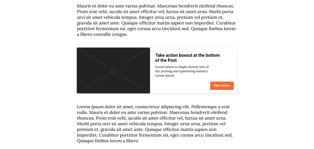
- PLANET-6069 – Implement the new Take action boxout design
- The whole card is clickable and can be placed between paragraphs in Posts and pages
- On desktop and tablets, the card appears depending on where you placed it in the body
- In the active state (when is hovered over) the card is surrounded by a dark grey shade
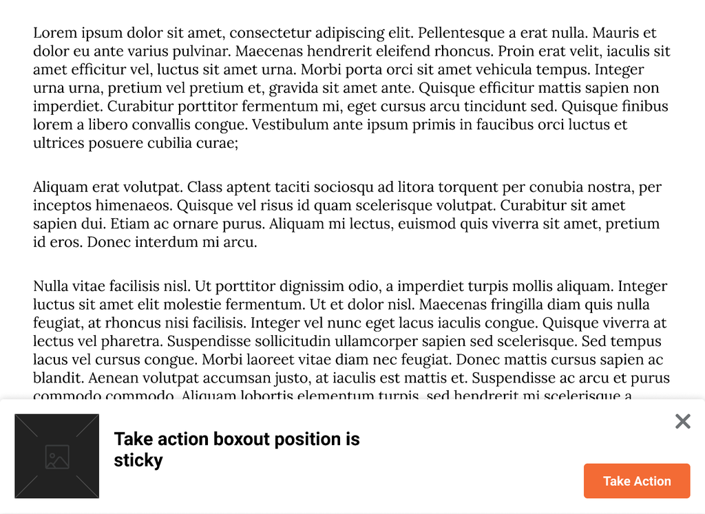
- On mobiles, the card is placed at the bottom of the screen as a sticky component
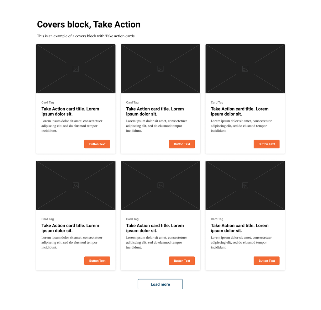
- PLANET-5608 – Covers: Implement “Take action” style new design
- Specifications:
- The entire card should function as a clickable link
- Card height is fixed
- Only show one tag, even if more exist
- Limit card title to 60 characters
- Limit card description to 110 characters
- Limit button text to 20 characters
- Button uses a new style, “Primary CTA small”
- Button stays in the bottom right of the card, even when the card text does not fill the entire space.
- Specifications:
- PLANET-6008 – CTA buttons: align with the design system
- Follow the design styles from the design system for passive, hover & active states, and create a focus state (only for keyboard interactions) for primary and secondary CTA buttons, donate buttons, and Social media buttons
- Remove the drop shadow from all CTA buttons.
- Remove the border color style on the primary button hover state
- PLANET-5765 – Remove jQuery from post_action.js
- PLANET-6006 – Gallery block – Make the carousel style consistent
- replace navigation arrows with the new ones from the design system
- replace the page controller with the stripes (similar to the Carousel Header block)
- make the images swipe on mobile since we don’t show the arrows
Bug Fixes 🐞
- PLANET-6460 – Covers block buttons not accessible with keyboard
- On the Covers block, it’s not possible to press the button using the keyboard. This is because the event listener uses the “mouseup” and “touchend” events. Converting this to use “click” will still fire in the same cases, but also for a keyboard.

