Pull out dynamically your posts to promote organic navigation!
📚 Create Content > Blocks > Posts List (previously Articles)
Definition & Purpose
Definition
Use the Posts List block to insert a list or grid of the latest articles, press releases, and/or publications, organized by publication date. This block automatically pulls and sorts these posts according to their type, tags, and categories.
Purpose
Highlights Posts so that users can easily see and navigate to the latest and most relevant articles, press releases and/or publications.
Add the block to your page
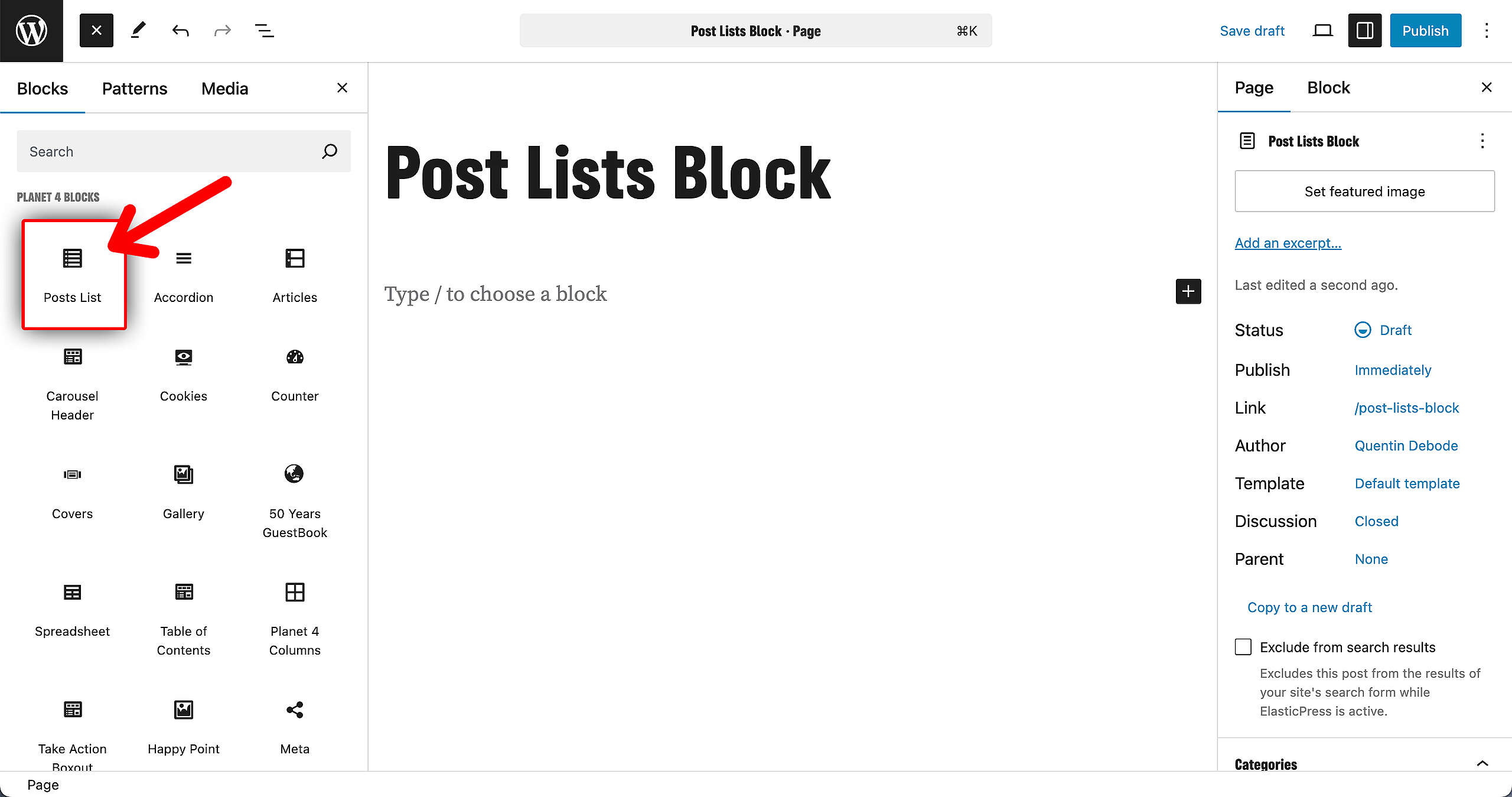
The block is automatically added at the end of Posts and can be manually added in Pages by selecting in the Planet 4 blocks menu.
Customize the block
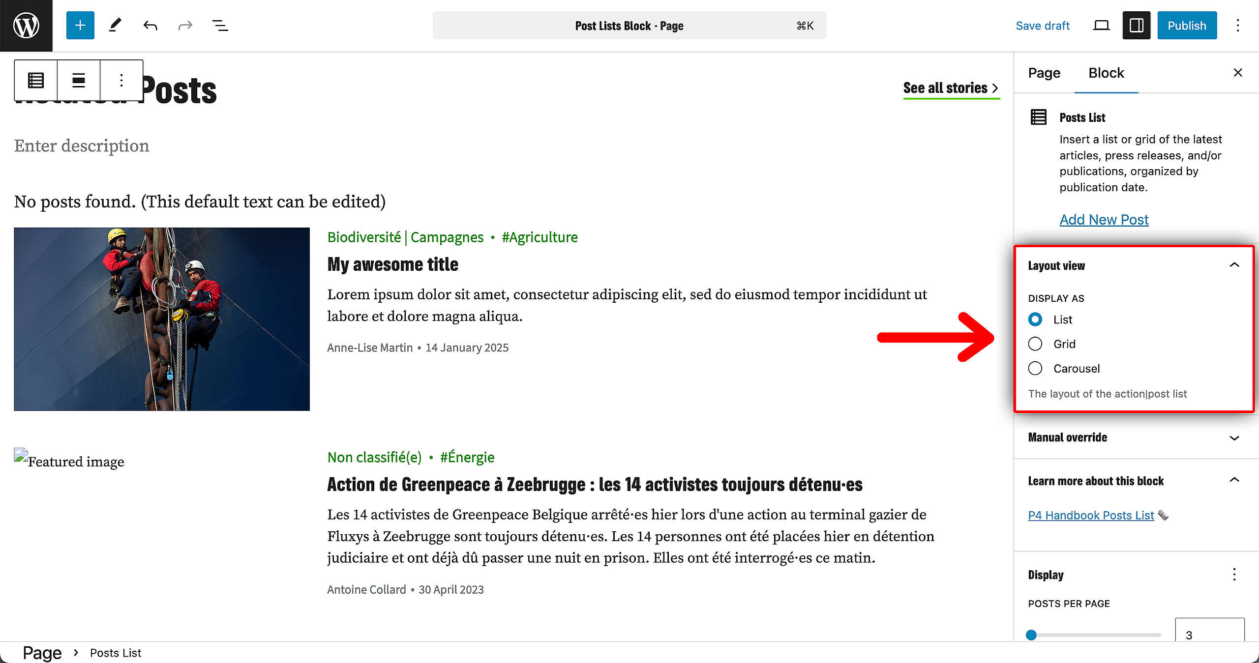
The following fields can be edited for the articles block:
The title, the description and the button text to load more results can be edited right inside the block. The rest of the options have been moved to the menu on the right side.
- title: there is a default setting (for the EN sites, this is set to Latest articles). You can change and rename this field differently in place, inside the block
- description: add a description for the latest articles block
- button text: if you choose this block to link to a different page or post, you can add a button, therefore you need to edit this field. There is a default setting for this as well – Load more
- button link: here you should add the URL of the post/ page
- open in a new tab: tick this if you want the post/ page to open in a new page. If you want the user not to navigate on a different tab, then leave this field un-ticked
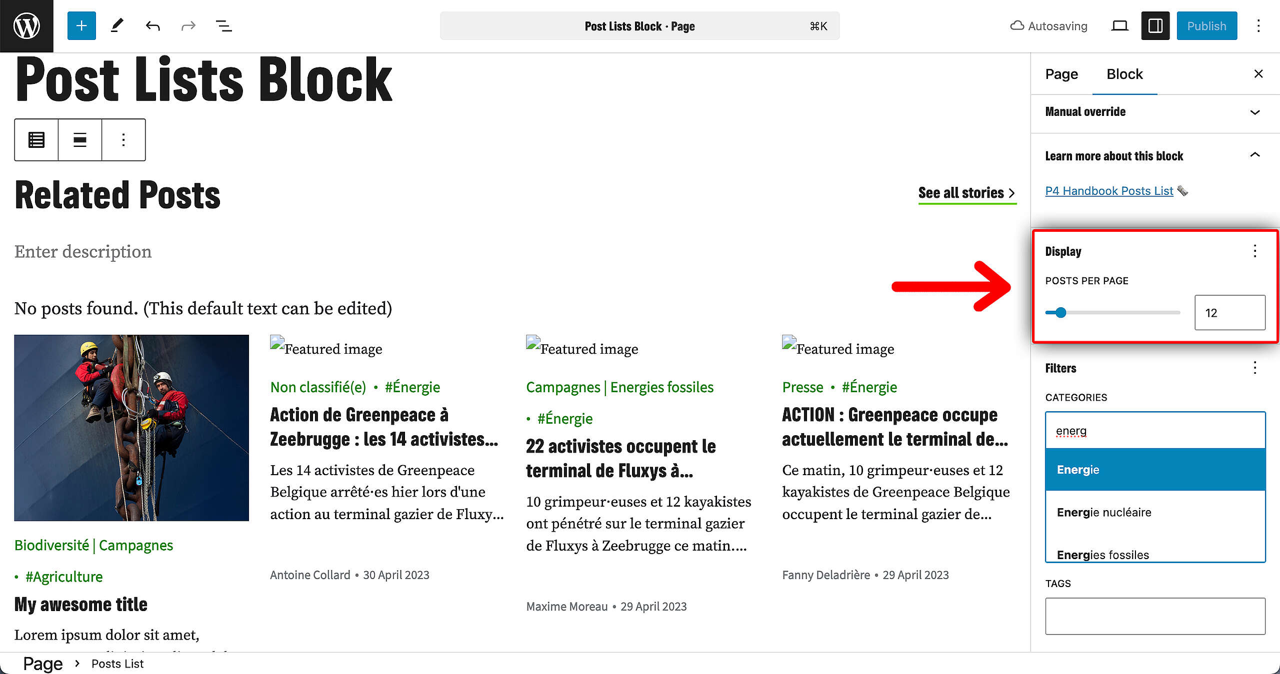
- articles count: how many Posts you want to be displayed in this block
- select tags: by adding specific tags, the corresponding content will be pulled
- post types: here you determine what type of post you want to be pulled in this specific block: either story, press release, publication or any other type of post there is available on the site
- ignore categories: by default, the block will only display posts from the same category the post/page is assigned to. This option is about ignoring that rule and showing everything
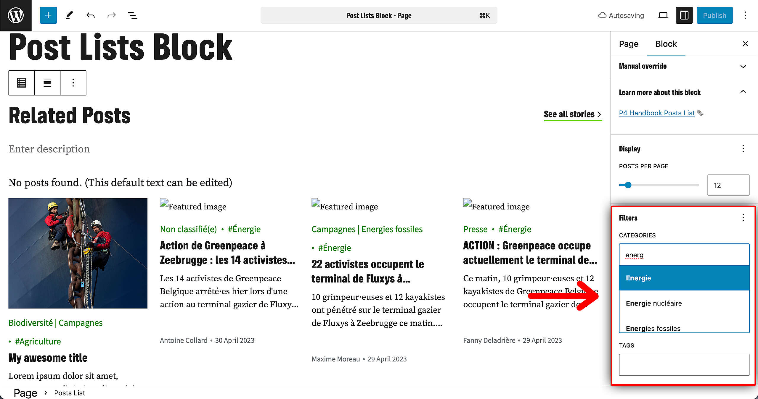
The preview is static: tags and links are not clickable in the preview window in the backend so that it is clear which elements are editable or not.
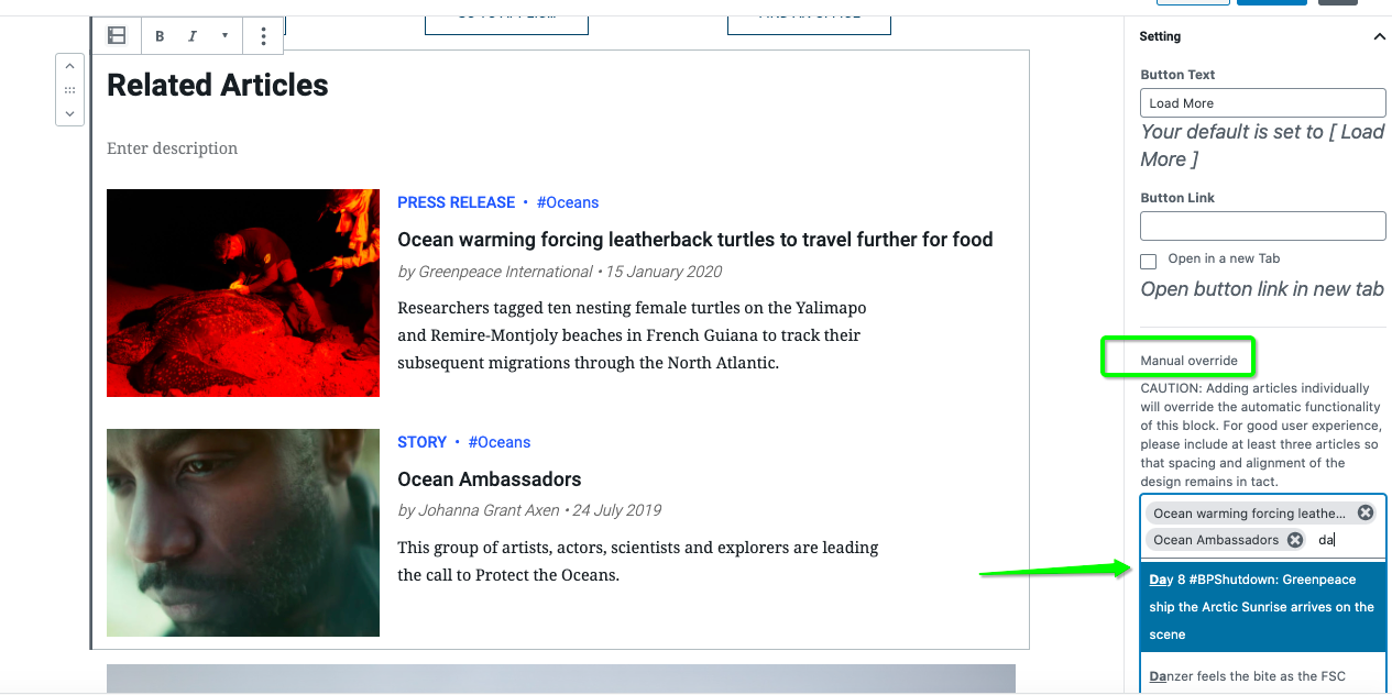
Manual override of posts
If you want specific pieces of content to be pulled out, you can customize the order with specific posts. In this case the posts will be displayed in order of publication date, most recent displayed on the top.
🤔 Key Info : It is possible to manually select custom posts for display, even when filters such as tags or categories are applied. However, if the manually selected posts do not meet the criteria of the active filters, they will not be displayed within the block.
Once this field is being used, the tags and post types fields are unavailable.
