IA & Nav : What’s Changed
Discover what the new Information Architecture brings to Planet 4.
📚 Manage Planet 4 > Information Architecture > What Changed
Activation of the New IA
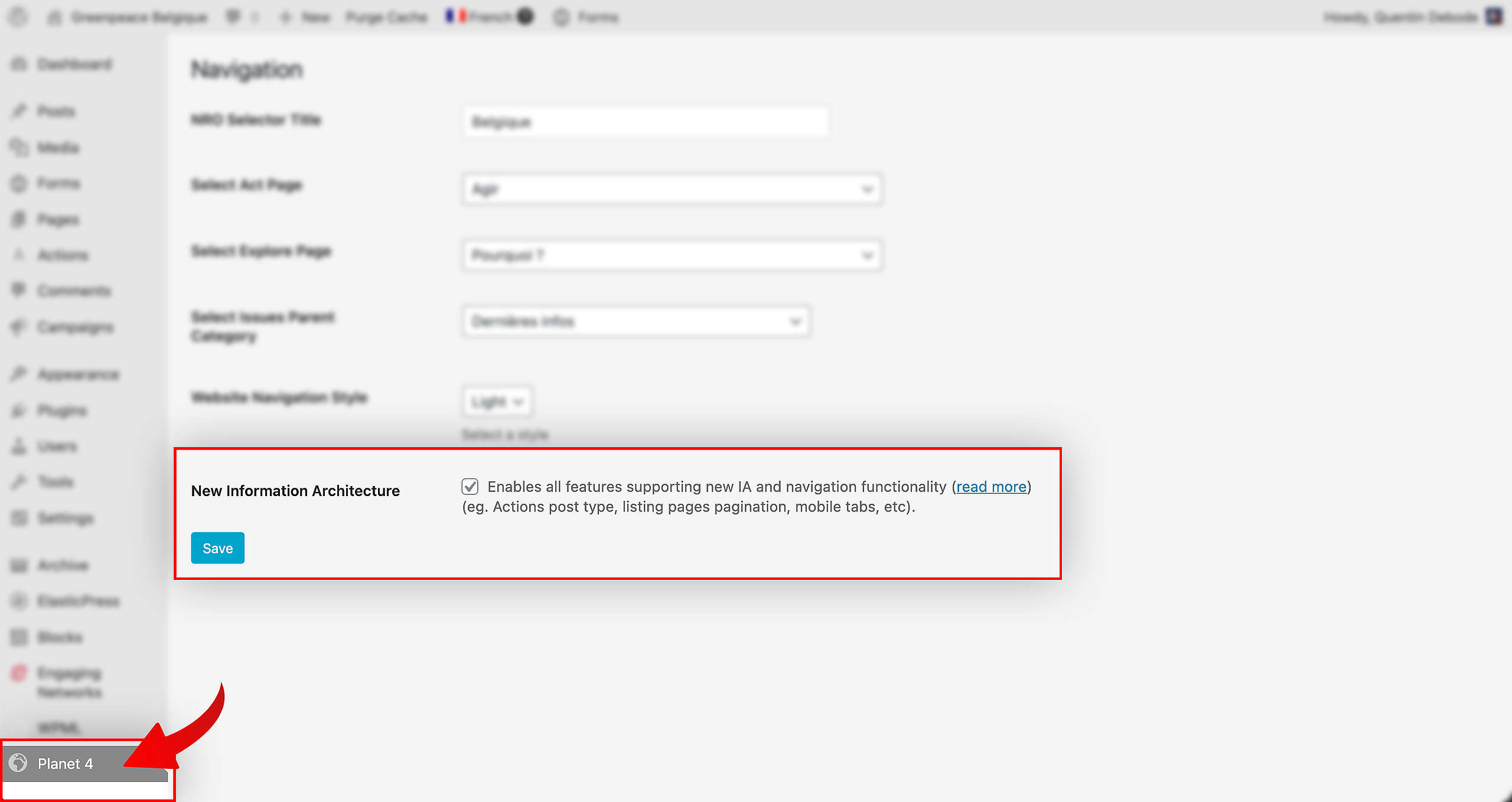
🔎 Where can I find this ? Dashboard > Planet 4 > Navigation
Inside the Planet 4 settings (that you can find in your Dashboard), you’ll find a toggle to activate the new Information Architecture for your website. You need to do this first, or you won’t see the new features and options of the new IA. Just check the checkmark and click Save, and you’re good to go.
Done? Let’s go!
Pages
New Homepage
As part of the implementation of the new visual identity, the home page and other page templates are now cleaner, more modern and coherent with Greenpeace’s visual identity, thus reinforcing the legitimacy of our organization and increasing the potential to engage with supporters.
The new Homepage is a totally different experience than before. There are several new Blocks to use, fresh Patterns, better use of space, cleaner navigation and so on. There’s even a new Template for you to start from.
Get Informed
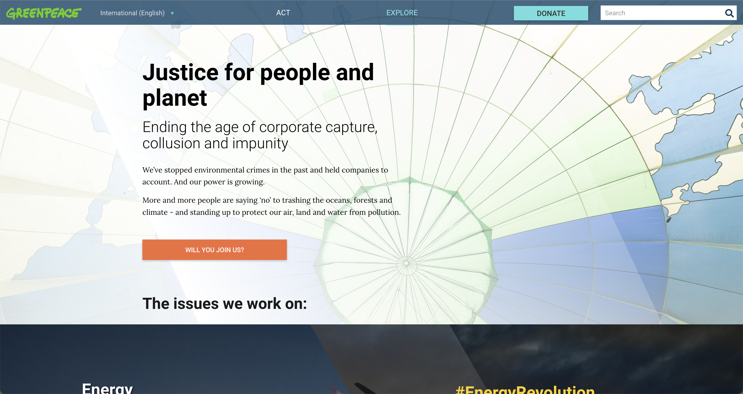
This new page is replacing the current Explore page.
In this new overview page of information, the goal is simple: Show who Greenpeace is and more importantly the topics we work on. Present this information thanks to a bunch of new Blocks and Patterns, such as the Issues Pattern (that comes with brand new icons!), the improved Articles Block, side by side images with text and more.
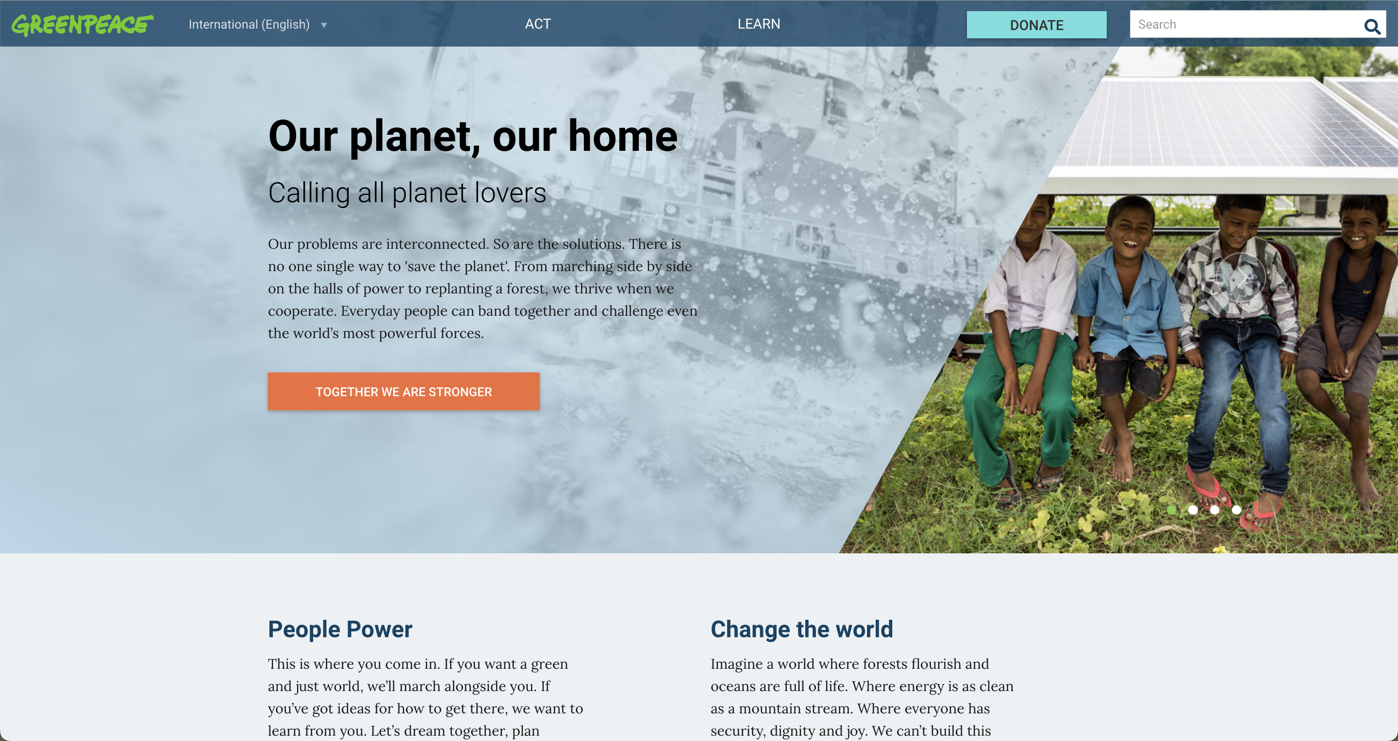
Before
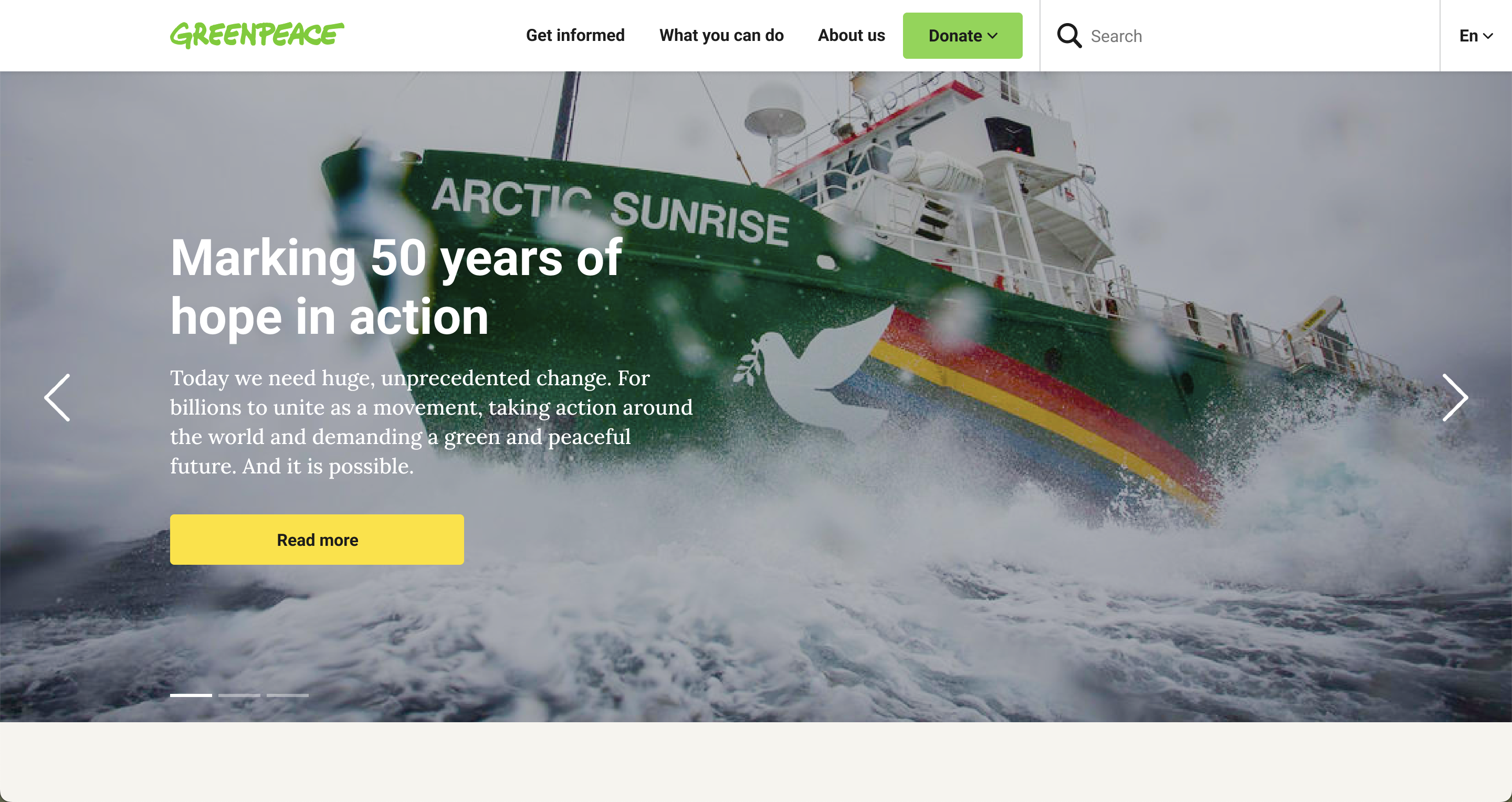
Now
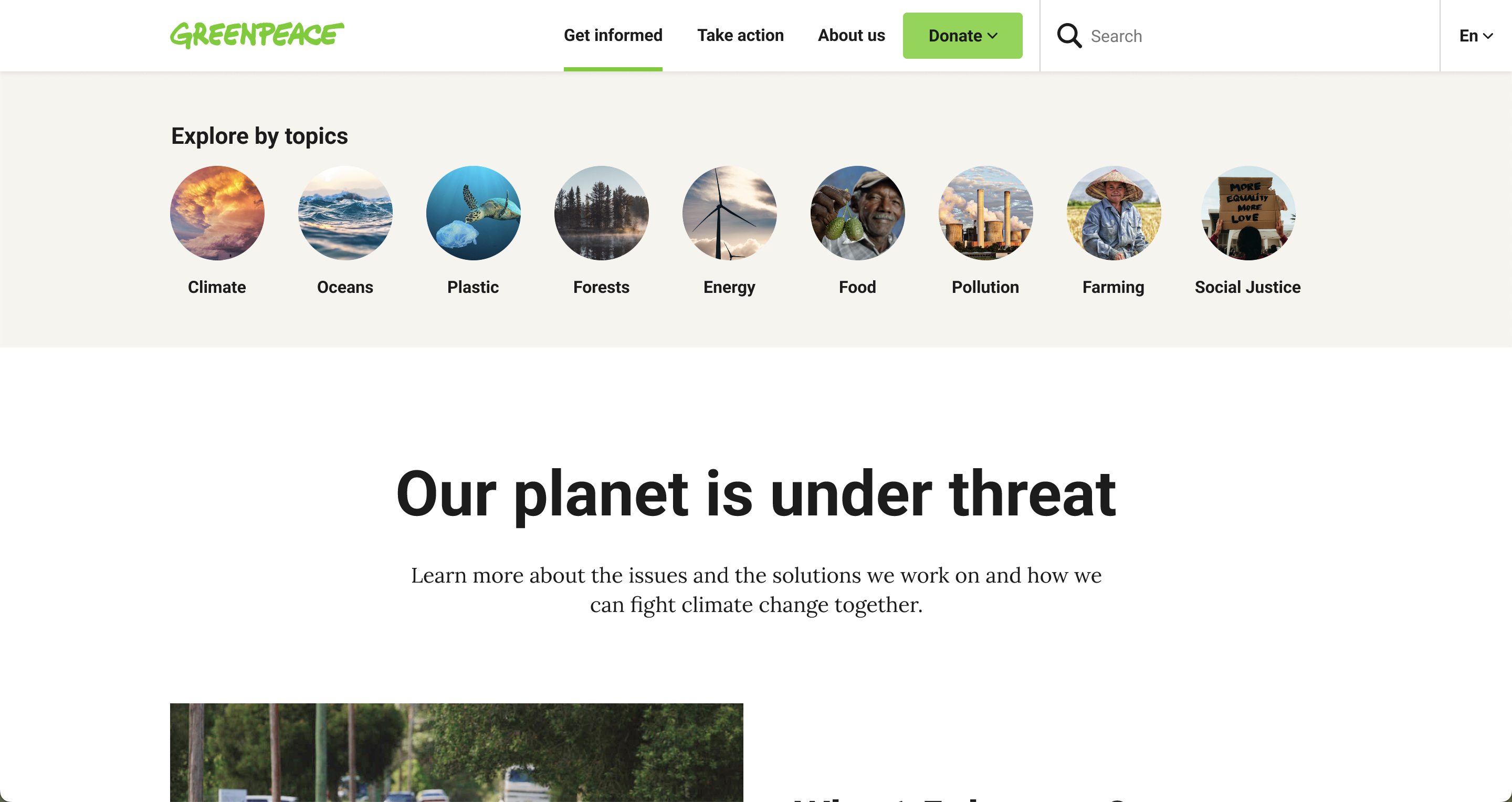
Notice here in the navigation bar: Get Informed, What you can do, about us. All of these are categories established after the careful audit, research and acknowledgment of what users were looking for in this website.
Take Action
This new page should replace the current Act page.
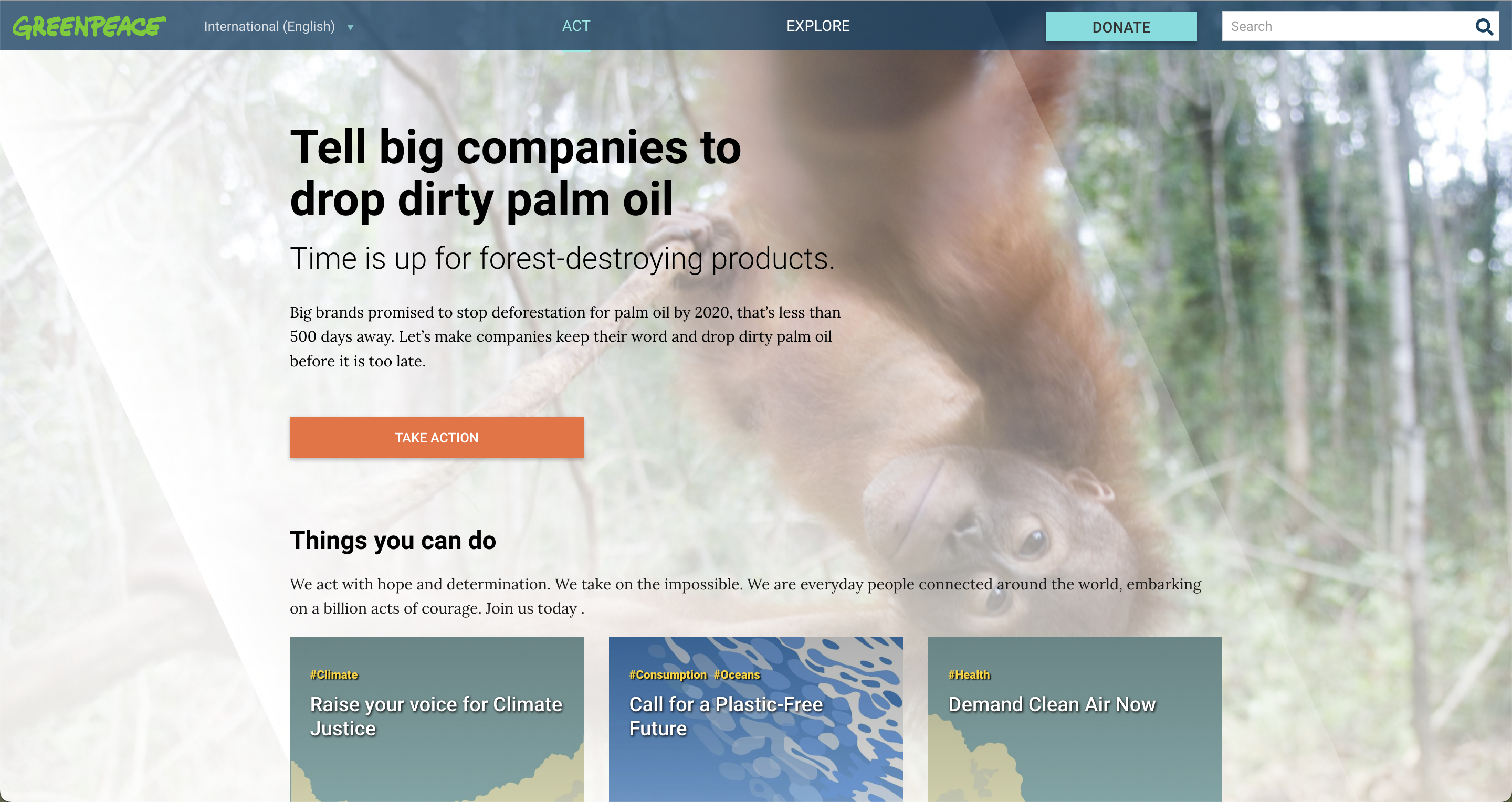
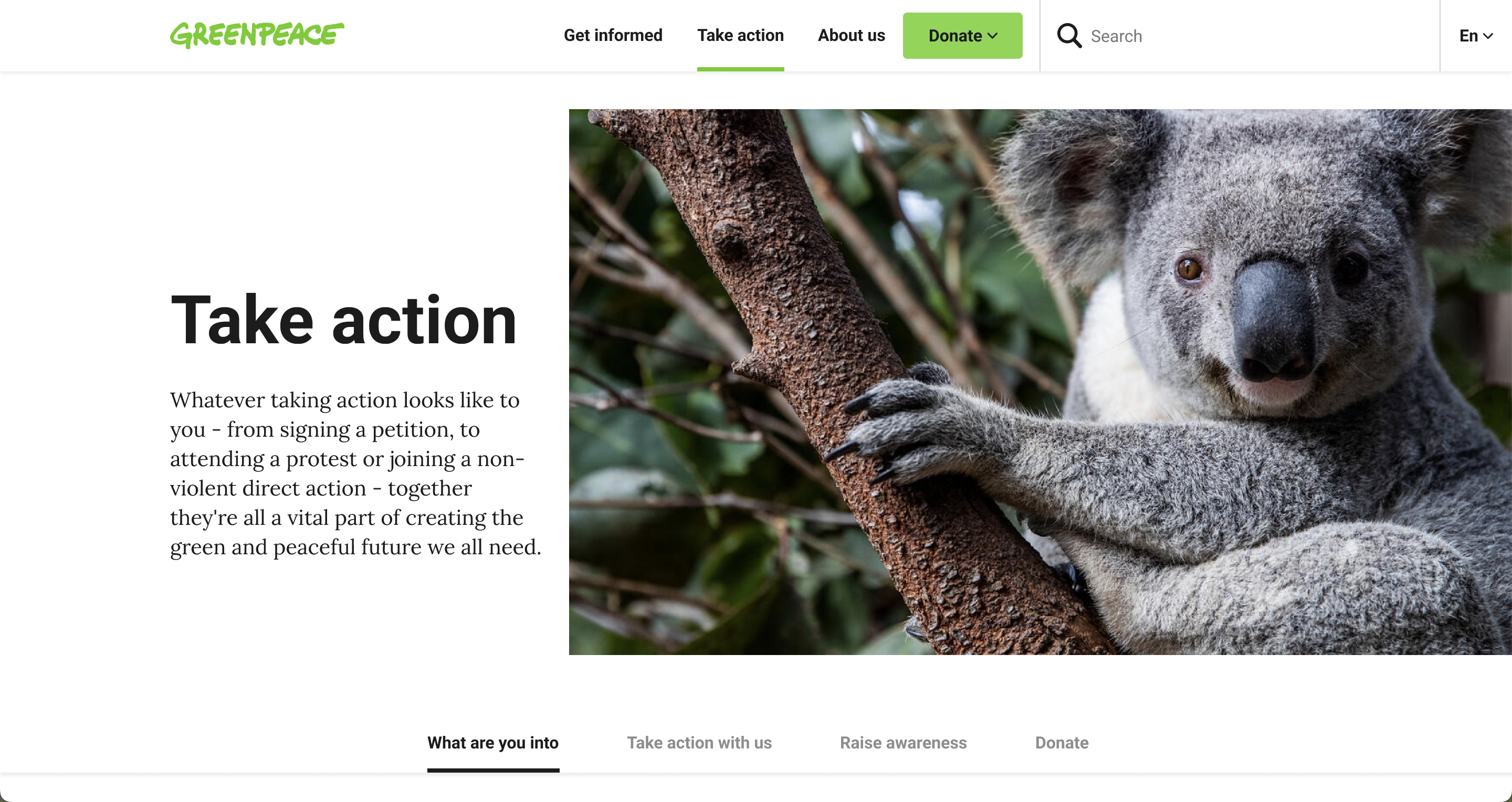
The new Take Action page is the homepage for all actions your visitors can take. Share information about what your NRO is doing, how they can participate or raise awareness, or even donate and become a Greenpeace supporter. Of course, this page is also supported by a bunch of new Blocks and Patterns such as Take Action Blocks, a Deep Dive Topic Links Pattern to let your visitors learn more about the issues and more.
Before
Now
High Level Topic Page
This new page should replace the current Issue page.
In order of priority, they:
- Inform through visual storytelling.
- Showcase related stories and news.
- Offer various ways for people to engage.
High-level topics are:
- .. present in the navigation.
- .. ‘parent’ to deep-dive topics.
- .. fairly long-term/evergreen.
- .. tied to WordPress Categories.
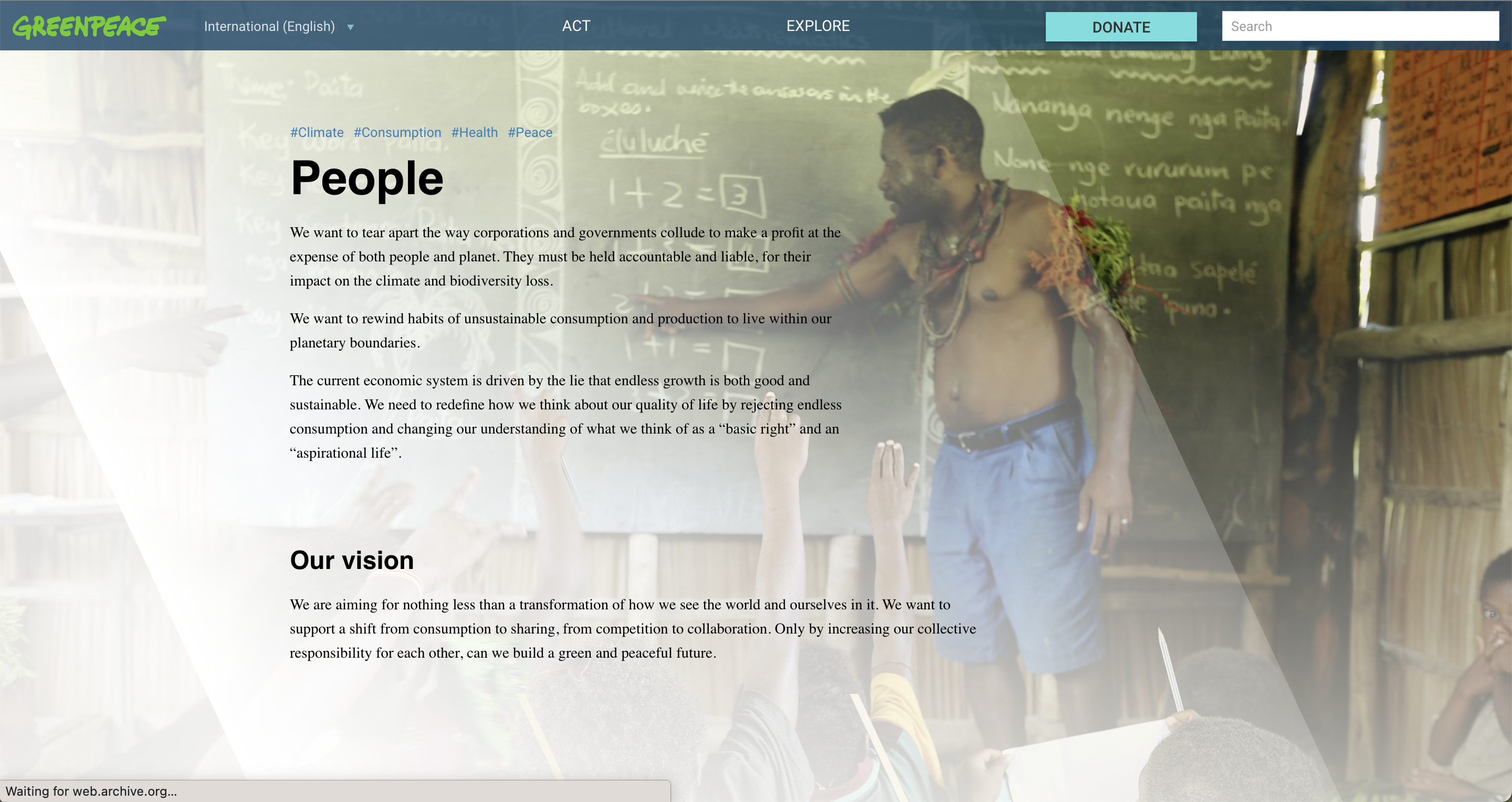
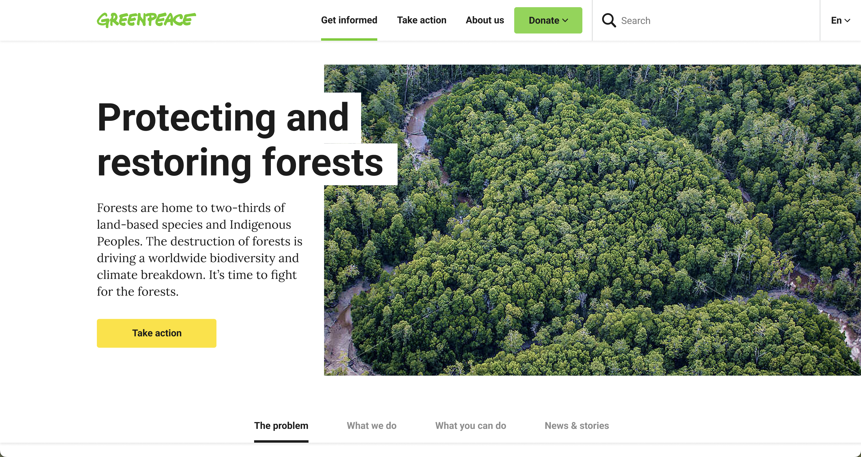
Got several topics related to one overal subject? Welcome to the High Level Topic Pages. Here you can visually showcase the problem, what we do, what’s been done about it and related articles. Make use of several Blocks and Patterns such as the Reality Check, Deep Dive Links, Timeline, Highlighted Call To Action and more.
Before
Now
Deep Dive Topic Pages
This new page should replace the current Tag page. Deep-dive topics are more granular topics within the high-level topic.
In order of priority, they:
- Summarize more granular problem(s), solution(s) and Greenpeace’s focus area(s).
- Offer various ways for people to engage.
- Inform through visual storytelling.
- Showcase related stories and news.
Deep-dive topics are:
- .. present on high-level topic pages.
- .. under one high-level topic, otherwise a tag.
- .. fairly long-term/evergreen.
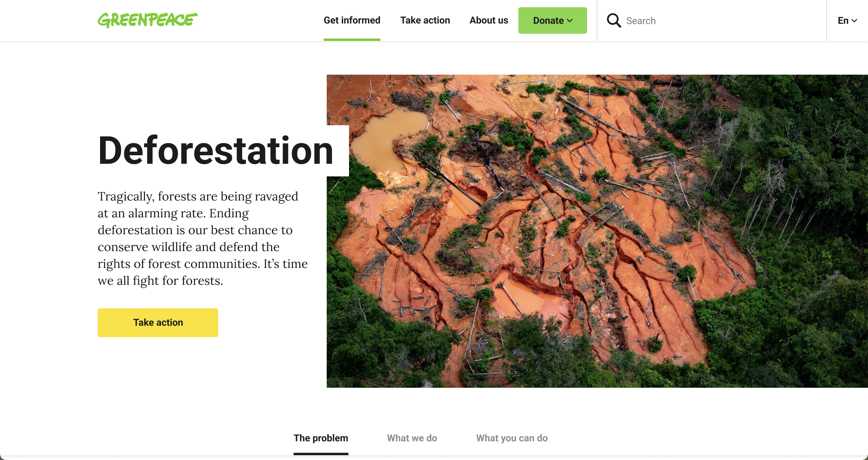
The new Deep Dive Topic Pages are a new way to present a specific subject. Feature clear Call To Actions by the use of Blocks and Patterns, showcase the issues by adding images with explanations and let them discover more information by clicking through to related topics.
Before
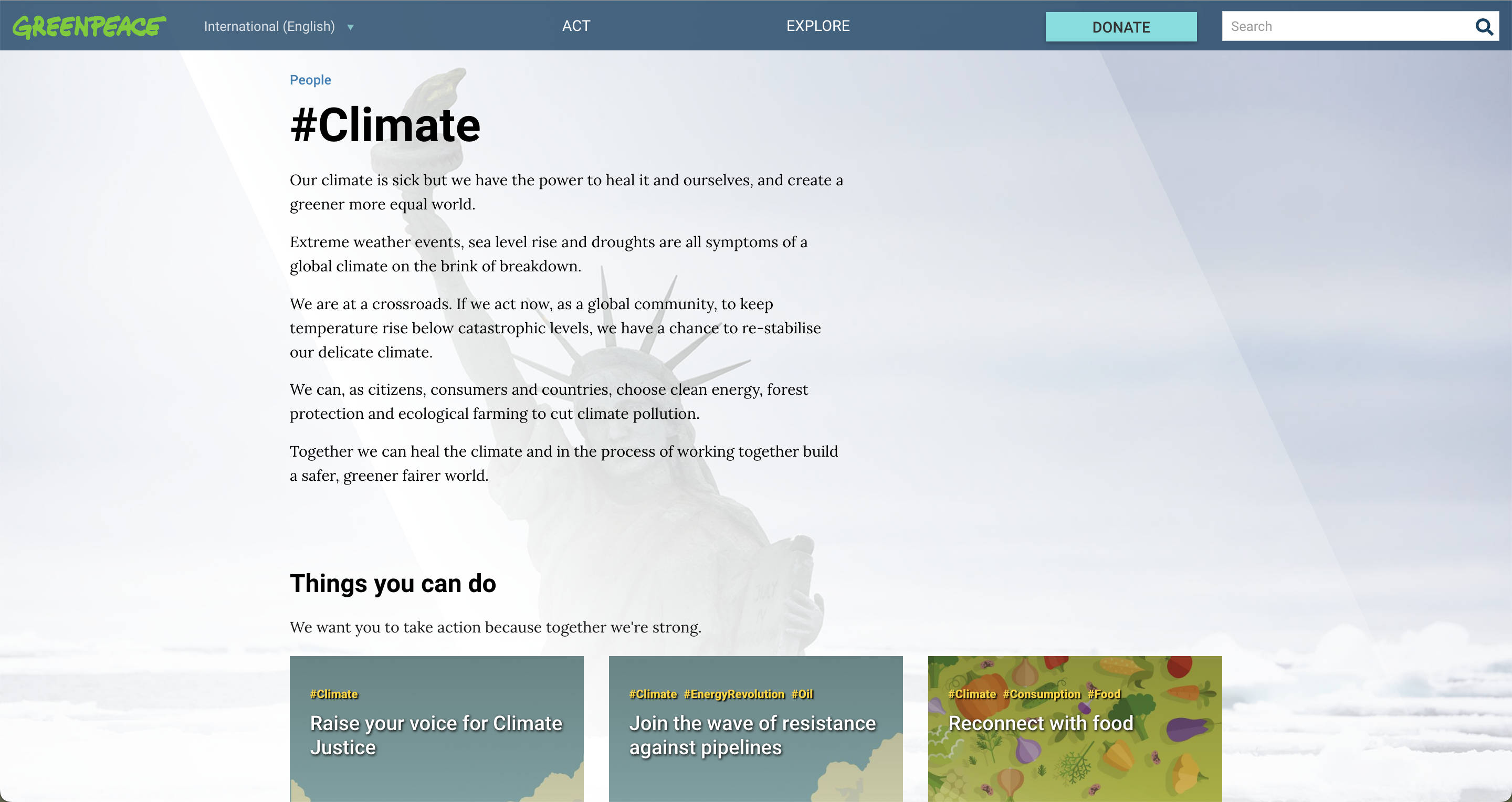
Now
Listing Pages
Mainly for categories and tags.
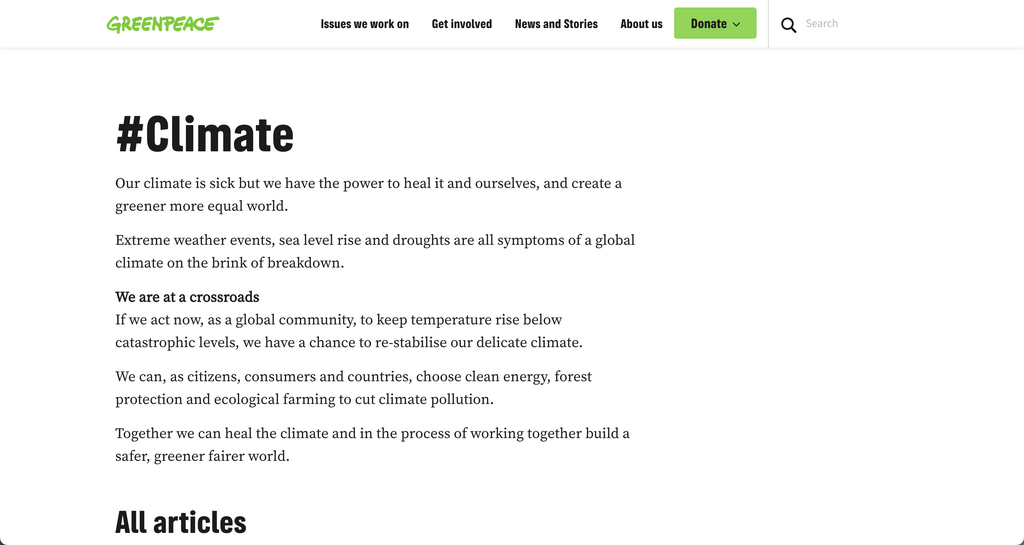
Besides a new design, the new listing pages have a couple of new features such as a back button to return to the “parent” or “News” page itself. There’s a featured action, which can be generated automatically or selected manually. Users of the site can choose between a Grid view, or a List view and at the bottom of the page, there’s also a Quick Links Block Pattern (which can be placed anywhere else if you so desire).
Before
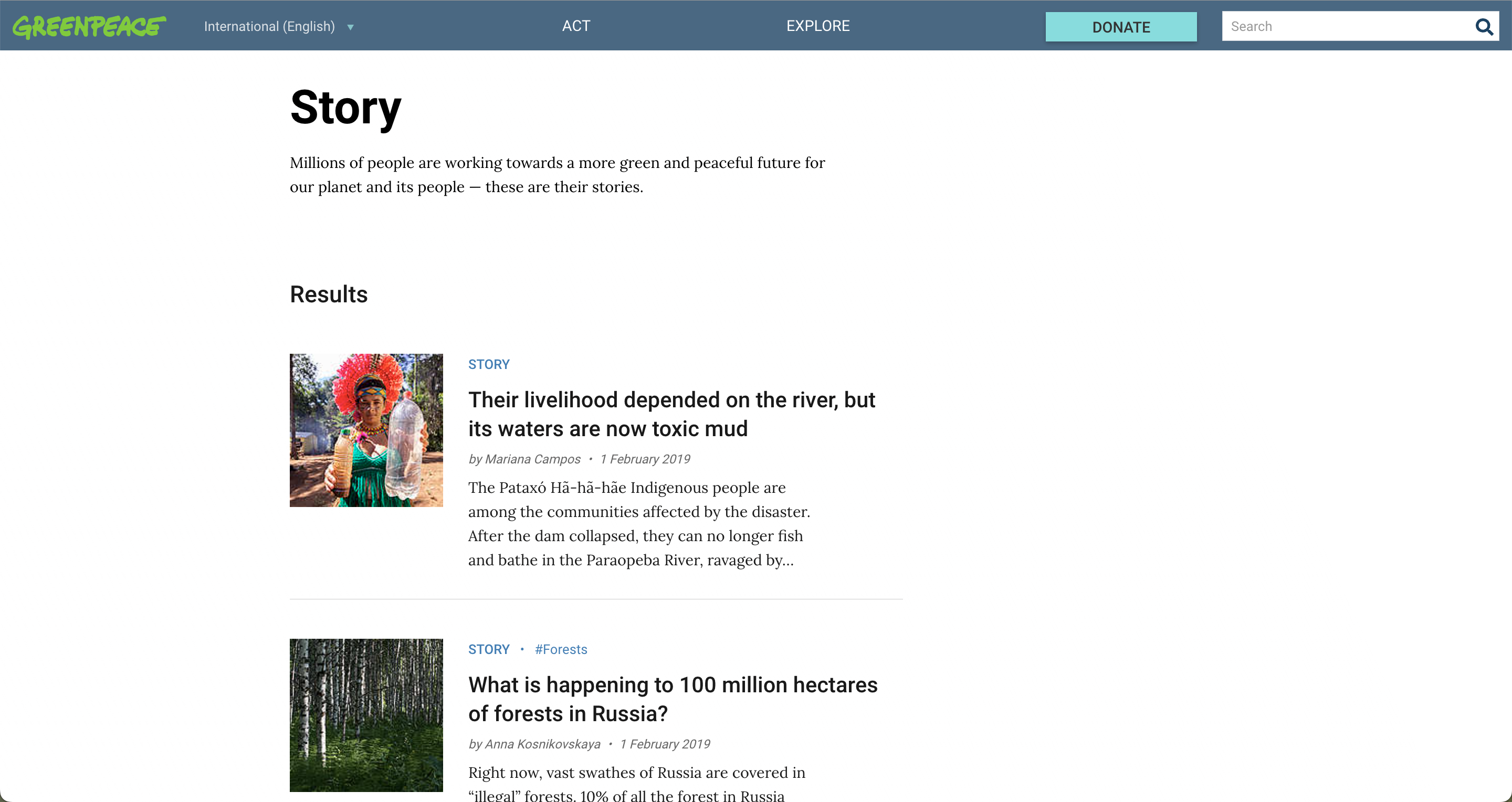
Now
Action Pages
This new page should replace the current Take action page. Action pages are focused on a specific problem, have a specific goal/target, and often relate to a deep-dive topic.
In order of priority, they:
- Highlight a specific call to action.
- Summarize the specific problem and solution.
- Showcase related actions or news.
Campaigns are:
- .. present on the Take Action page.
- .. listed on the relevant high-level topic page.
- .. actively maintained and ‘archived’ upon the campaign’s end.
- .. royally linked to from other pages
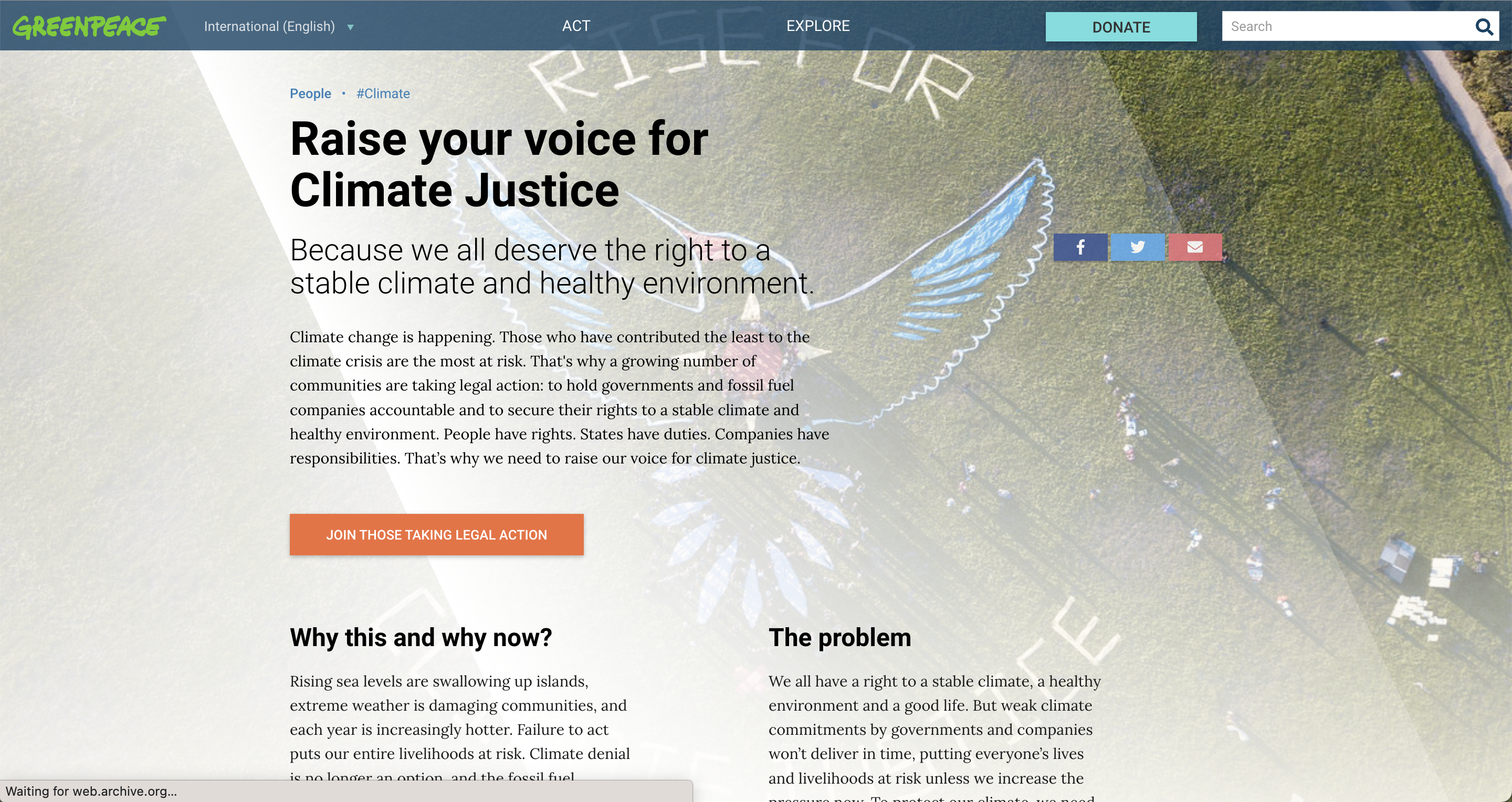
A mighty new Action Page template is here! Embed the petition right at the top of the page with a strong title and description, as well as a compelling image to showcase the issue your petition is about. You can customise the page more by adding Blocks and Patterns, such as for example other Call To Actions for related topics.
Before
Now

Blocks and Patterns
Articles (improved)
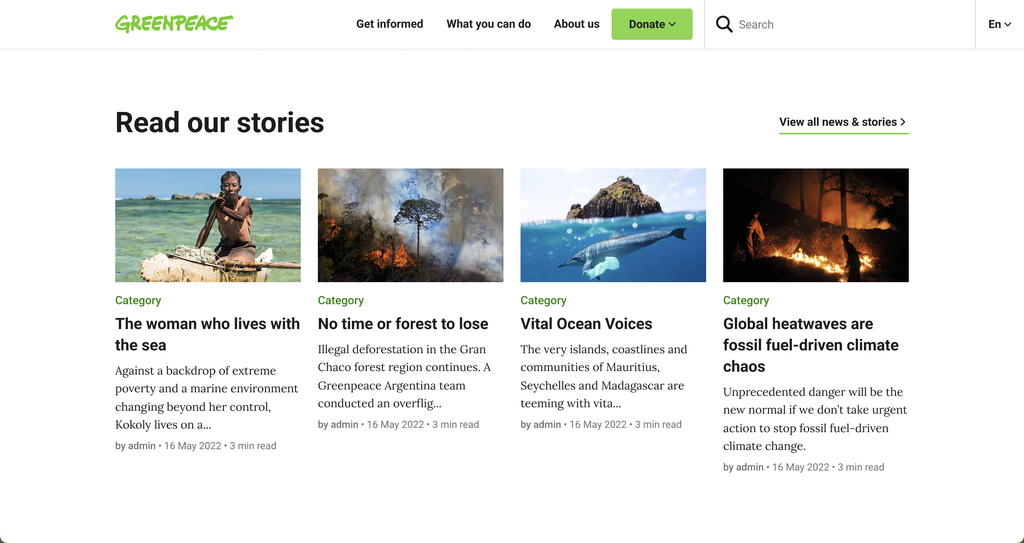
A new and improved design for the Articles Block. Users will can also change their overview (choosing between grid and list views).
Media & Text
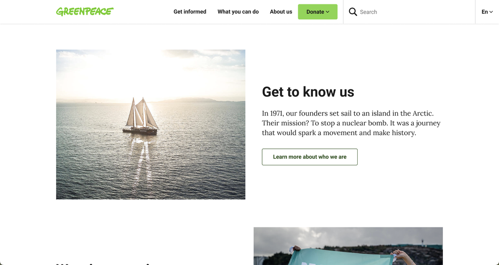
Combine visual elements with texts (and even buttons!) and create powerful combinations to make your pages visually stronger.
High Level Topic Links
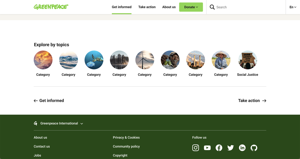
Make the access to High Level Topics easier by combining icons/images and text. The new Quick Links Pattern can also be used a sort of secondary navigation, either at the top or bottom of your pages.
Additionally, icons for these are provided here.
Deep Dive Topic Links
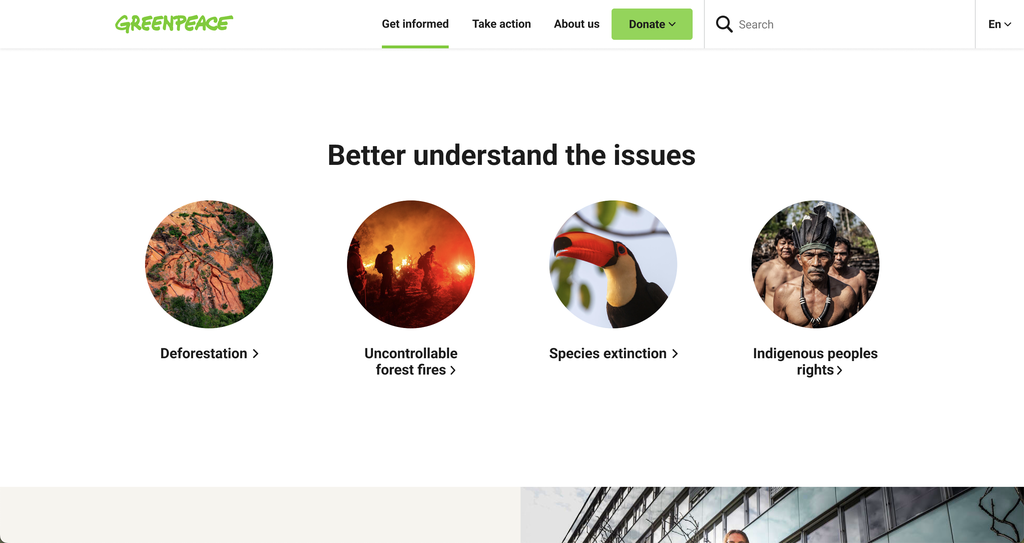
Guide visitors of your site towards Deep Dive Topic Pages thanks to this new pre-set Pannel. Combine a powerful image and CTA to forward visitors to a specific issue.
Issues
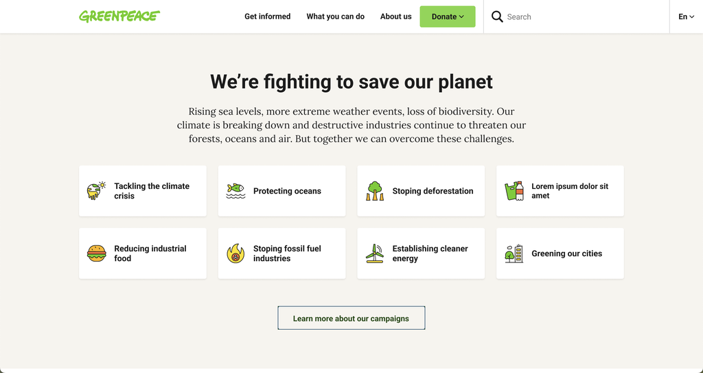
A beautiful and interactive way to provide an overview of what the main issues are that Greenpeace are working on. These links could redirect to either type of Topic Pages.
Additionally, icons for these are provided here.
Reality Check
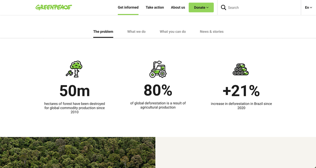
Combine icons and text to provide quick figures and showcase an issue. Make the visitor immediately aware of the issues with some hard facts.
Additionally, icons for these are provided here.
Forms
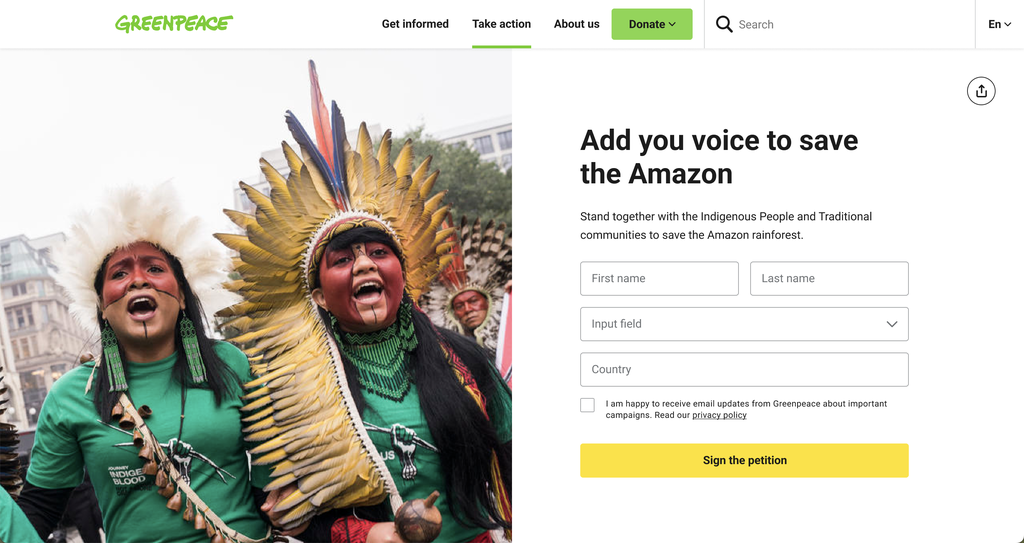
Build with Gravity forms, these different types of Forms (petitions, sign ups, contact, …) are easy to use and implement on Action Pages and everywhere else.
Highlighted Call To Action
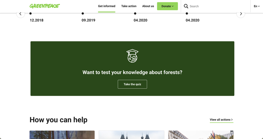
Make sure your Call To Action stands out, thanks to using the Highlighted CTA Block Pattern. Choose from flexible design options and make it your own by changing images, alignments, text, buttons and more.
Navigation
Main Navigation

Help visitors navigate easily through Planet 4 with a powerful taxonomy and navigation. The previous menu only had “Act” and “Explore”, but in this new IA & Nav implementation, there’s the option to expand and build a more user friendly menu. Add multiple items, create drop down menus and more in the new Navigation options.
Secondary Navigation

The secondary navigation. Featured inside the page itself, this is to organise your content. Easier for the user, cleaner to look at and consume, everybody happy. Learn more here.
Bottom Navigation

At the bottom of the page, there is an extra way to navigate the site. Thanks to the arrows at the bottom of your pages, you can easily navigate to previous pages or move forward to the next.
New Categories and Tags
How the New Categories & Tags Should Work
Previously, the navigation was build on Categories and Tags but obviously, this will no longer be the case in the new IA. Categories are now tied to High Level Topic Pages (meaning they’re the main topics). Tags should be used only for granular content, like on Posts.
Categories on Posts can direct users to a Category Listing Page, or they can redirect towards a High Level Topic Page. You have the freedom to decide where those will go, it’s a setting in the Planet 4 Dashboard.
Categories = High Level topics
The main topics are currently treated as tags on most P4 websites. The idea is to walk away from this, and rely mainly on categories to represent the hierarchical structure of the site.
| Climate | Oceans | Forests | Plastic | Agriculutre | Food | etc… |
Tags on Post pages = More Granular Content
Should be used to show visitors more granular content specific to a post + to group content dynamically on listing pages.
| #Oil | #Amazon | #AirPollution | #Covid19 | #LGBTQIA | etc… |
Categories Listing Pages
Categories cluster high level topics together, with a list of Posts related to a topic, making relevant content easily accessible to both user and search engines.
In short, they:
- .. cluster content (Posts) together.
- .. have a listing page with all content.
Categories are:
- .. high-level topics, or dive topics.
- .. fairly long-term, but can be added to.
Please note that instead of using a listing page for categories, you could do a redirect to the High-level topic pages as per GP Nordics did.
Tag Listing Pages
Tags cluster other recurring topics together, with a list of Posts related to a topic, making relevant content easily accessible to both user and search engines.
In short, they:
- .. cluster content together.
- .. have a listing page with all tagged content.
Tags are:
- .. not high-level topics, nor deep-dive topics
- .. only to be used for recurring topics
- .. fairly long-term, but can be added to.
Coming Soon
Above this section you already had a chance to look at the many different Navigation options from the upcoming Planet4 v2. Here are some more previews of what to expect soon:
Timeline (improved)
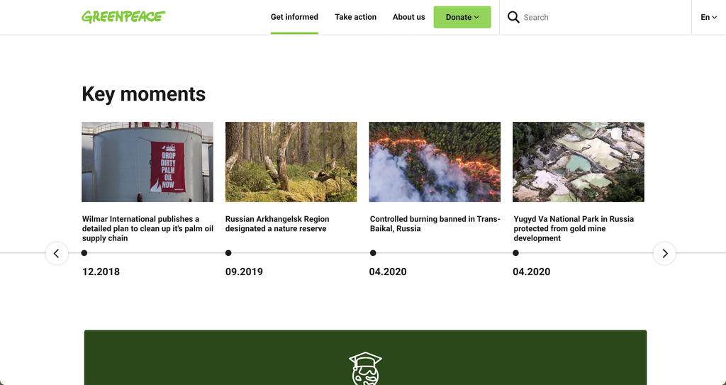
A fresh look for the Timeline Block to improve the user experience. Easier to use and cleaner to experience, the new design improved a lot to the previous version.

Join the Implementation
Liking what you see here? Check out how to implement this on your Planet 4 website.

